


The landscape of digital interaction has shifted fundamentally. Where desktop computers once dominated the internet, mobile devices now serve as the primary gateway for information, commerce, and communication. For designers, this shift demands a specialized approach. Mobile User Experience (UX) Design is not merely a scaled-down version of desktop design; it is a distinct discipline requiring an understanding of constraints, behaviors, and physical interaction patterns.
When designing for small screens, every pixel matters. The margin for error is slim, and the expectations for speed and intuitiveness are high. Users interact with these devices in varied environments—on the move, with one hand, amidst distractions, or with limited connectivity. To succeed, you must prioritize clarity, efficiency, and accessibility above decorative elements. This guide explores the foundational principles of mobile UX design, providing a framework for building interfaces that function well regardless of the device size.
Understanding the Mobile Context 🌍
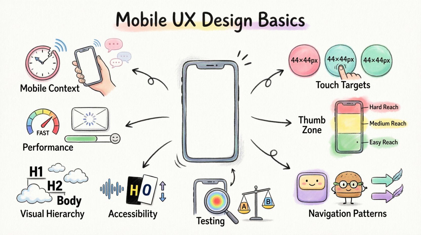
Before drafting a single wireframe, it is essential to understand where and how the product will be used. Desktop users often sit in a controlled environment with high-speed internet and two hands available. Mobile users exist in a fluid environment. They might be waiting for a bus, walking down a busy street, or sitting at a dinner table with poor lighting.
- Attention Span: Mobile attention is fragmented. Users scan rather than read. Content must be scannable and immediately relevant.
- Connectivity: Networks vary from 5G to weak 3G or offline states. Interfaces must handle latency gracefully.
- Physical Constraints: Screen real estate is limited. The interface must fit critical information without overwhelming the user.
- Input Method: Touch is the primary input. There is no mouse cursor to hover over elements for information.
- Distractions: Notifications, calls, and environmental noise compete for the user’s focus.
Recognizing these factors helps in making informed decisions about what to include, what to hide, and how to structure the flow. A feature that works perfectly on a large monitor might be unusable on a phone if it relies on precision hovering or deep navigation trees.
Core Principles of Mobile Interaction 🖐️
Touch interaction introduces unique challenges compared to a mouse. A finger is less precise than a cursor, and it occludes the content it is interacting with. Designing for touch requires specific adjustments to ensure usability and comfort.
Touch Target Sizing
One of the most critical aspects of mobile design is the size of interactive elements. If buttons are too small, users will miss them, leading to frustration. Industry standards generally suggest a minimum touch target size of 44 by 44 points (pixels). This size accommodates the average fingertip, reducing the error rate significantly.
- Spacing: Ensure there is adequate padding between touch targets to prevent accidental clicks on adjacent buttons.
- Visual Feedback: When a user touches a button, it should change appearance immediately. This confirms that the system registered the action.
- Reachability: Place frequently used actions within the natural reach of the thumb. Avoid forcing users to stretch their fingers to the top of the screen.
Gestures and Navigation
Gestures are natural and efficient, but they must be discoverable. Common gestures include swiping, pinching, and tapping. However, relying solely on gestures without visual cues can confuse users.
- Standard Gestures: Stick to conventions. Swiping to go back is standard in most operating systems. Inventing new gestures requires extensive onboarding.
- Haptic Feedback: Subtle vibrations can confirm actions like locking a screen or completing a form, adding a layer of sensory confirmation.
- Back Navigation: Ensure there is always a way to return to the previous screen, whether through a system back button, an arrow icon, or a swipe gesture.
Layout and Navigation Strategies 🗺️
Navigation on a mobile device requires a different hierarchy than on a desktop. You cannot display a massive sidebar menu or a complex tab bar. The structure must be linear and focused.
The Thumb Zone
Most users hold their phones in one hand. This creates a “thumb zone.” The area most easily reachable is the bottom center of the screen. Placing primary navigation here reduces physical strain and increases speed.
| Zone | Reachability | Best Use Case |
|---|---|---|
| Top | Difficult | Status bar, notifications, secondary actions |
| Middle | Moderate | Scrollable content, secondary navigation |
| Bottom | High | Primary navigation, CTAs, search |
Navigation Patterns
Choosing the right navigation pattern depends on the complexity of the application.
- Tab Bars: Ideal for 3 to 5 primary sections. They provide constant access to core areas.
- Hamburger Menus: Useful for secondary links that do not need constant visibility. However, they hide options, which can reduce discoverability.
- Bottom Navigation: The modern standard for primary content switching. It aligns well with the thumb zone.
- Swipe Navigation: Excellent for galleries or distinct content sections, such as onboarding flows or carousels.
Visual Hierarchy on Small Displays 👁️
Without the luxury of wide screens, visual hierarchy becomes the primary tool for guiding the user’s eye. You must prioritize content ruthlessly. What is essential? What is secondary?
Typography and Readability
Small screens require larger type to remain legible. Text that looks fine on a monitor may be unreadable on a phone. Use a base font size of at least 16 pixels for body text.
- Line Length: Keep lines short. Optimal line length is 50 to 75 characters. Long lines force the eye to travel too far horizontally.
- Line Height: Increase line height to at least 1.4 to 1.5 times the font size to prevent text from feeling cramped.
- Contrast: Ensure high contrast between text and background. Gray text on a white background is often too low contrast for mobile reading.
Whitespace
Whitespace is not wasted space; it is an active design element. On mobile, whitespace separates content blocks, making them easier to digest. Crowded screens create cognitive load.
- Grouping: Use whitespace to group related elements together. This creates a visual connection between items without needing borders.
- Focus: Isolate key actions or headlines with padding. This draws attention to what matters most.
Performance and Loading States ⚡
Performance is a core component of UX. A beautiful design that loads slowly will be abandoned. Mobile users expect instant responses. Network speeds fluctuate, and processing power varies across devices.
Optimizing Assets
- Image Compression: Use modern image formats and compress files to reduce load times without sacrificing quality.
- Lazy Loading: Load images and content only when they come into view. This saves bandwidth and speeds up the initial render.
- Code Efficiency: Minimize the number of HTTP requests. Combine scripts and styles where possible to reduce server calls.
Handling Delays
If a process takes time, communicate that to the user. Do not leave the screen blank.
- Skeleton Screens: Show a grayed-out version of the layout while content loads. This makes the wait feel shorter than a spinning loader.
- Progress Indicators: For long tasks, show a percentage or progress bar so users know how long to wait.
- Offline States: Design for when the internet cuts out. Allow users to view cached content or save data locally.
Accessibility and Inclusivity ♿
Designing for mobile also means designing for everyone. Accessibility ensures that people with disabilities can use your product. This is not just an ethical requirement; it often improves the experience for all users.
Screen Readers
Many users rely on screen readers to navigate their devices. Images must have alt text. Buttons must have descriptive labels. The logical reading order of the content must match the visual order.
- Labels: Use text labels for icons. Do not rely on icons alone to convey meaning.
- Focus Order: Ensure that keyboard navigation (for those using assistive tech) moves logically through the interface.
Visual Impairments
Color blindness and low vision affect how users perceive the interface.
- Color Contrast: Adhere to WCAG guidelines for contrast ratios. Text should stand out clearly against the background.
- Font Scaling: Respect the user’s system font size settings. Do not force a specific font size that overrides user preferences.
- Information Beyond Color: Do not use color alone to convey information. If a field is invalid, use an icon or text label in addition to turning the border red.
Common Pitfalls to Avoid ❌
Even experienced designers fall into traps. Recognizing common mistakes can save time and prevent user frustration.
| Pitfall | Impact | Solution |
|---|---|---|
| Small Click Targets | High error rate, frustration | Increase size to 44×44 pixels minimum |
| Too Many Pop-ups | Interrupts flow, blocks content | Use non-intrusive banners or bottom sheets |
| Hidden Navigation | Users get lost easily | Use bottom nav bars for primary sections |
| Auto-play Media | Consumes data, distracts user | Default to muted or paused state |
| Long Forms | Drop-off rates increase | Break into steps, use appropriate keyboards |
Testing Your Mobile Designs 🧪
Design is never finished until it has been tested. Assumptions about how users interact with your product are rarely accurate. You must validate your designs with real users on real devices.
Usability Testing
Observe users as they attempt to complete tasks. Watch for hesitation, confusion, or errors. Ask them to think aloud so you understand their mental model.
- Remote Testing: Use tools to record users on their own devices. This provides insights into their real-world environment.
- Device Labs: Test on a variety of screen sizes and operating systems. A layout that looks good on an iPhone might break on an Android device.
- A/B Testing: Test different variations of a design element to see which performs better in terms of conversion or engagement.
Analytics
Quantitative data complements qualitative testing. Track where users drop off in a funnel. If many users abandon a form at a specific field, that field may be confusing or too difficult to use.
- Heatmaps: Visualize where users tap most frequently. This can reveal if important buttons are being missed.
- Session Length: Short sessions might indicate users cannot find what they need quickly.
- Error Rates: Monitor system errors or form validation failures to identify technical or design issues.
Mobile vs. Desktop Considerations
To further clarify the differences, here is a comparison of how design decisions often diverge between platforms.
| Feature | Mobile Approach | Desktop Approach |
|---|---|---|
| Input | Touch, Voice, Gesture | Mouse, Keyboard, Trackpad |
| Layout | Vertical Scrolling, Single Column | Grid Systems, Multi-column |
| Navigation | Bottom Bar, Hamburger Menu | Top Bar, Sidebar |
| Hover States | None (Tap replaces Hover) | Hover for extra info |
| Content | Essential only, Progressive Disclosure | More detailed, dense information |
Summary of Key Takeaways
Creating great mobile experiences requires a balance of technical constraints and human behavior. By prioritizing touch targets, optimizing for the thumb zone, and maintaining performance, you build a foundation of usability. Accessibility ensures that your product is inclusive, while rigorous testing validates your assumptions.
The mobile screen is a canvas of limited space but immense potential. When you respect the user’s context and physical interaction, the design becomes invisible. The user does not notice the interface; they simply accomplish their goal efficiently. This is the essence of good mobile UX design.
Focus on the core needs. Remove the unnecessary. Test constantly. Adapt to feedback. By following these principles, you can craft interfaces that resonate with users and perform reliably in the real world.

