


User experience design is often misunderstood as merely making things look attractive. While aesthetics play a significant role, the core of UX lies in functionality, logic, and empathy. For those starting their journey, the learning curve can be steep. Many designers fall into traps that compromise the usability of their products. These errors often stem from a lack of experience or an over-reliance on intuition rather than evidence.
This guide addresses the most common pitfalls encountered by newcomers to the field. By understanding these errors and applying corrective measures, you can build interfaces that are intuitive and effective. We will explore the psychological underpinnings of design choices and provide actionable steps to rectify them.
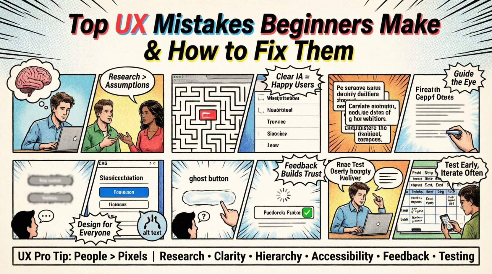
1. Ignoring User Research and Relying on Assumptions 🧠
One of the most prevalent mistakes is designing based on what the designer thinks the user wants, rather than what the user actually needs. This assumption-based approach often leads to features that are unused or confusing. Beginners frequently skip the research phase to save time, believing they can intuit the requirements.
Signs You Are Making This Mistake:
- Lack of Personas: You do not have defined profiles of who will use the product.
- Personal Bias: Decisions are driven by your own preferences or habits.
- Missing Context: You do not know where or how the user will access the interface.
- Feature Bloat: The product includes too many features without clear justification.
- No Validation: You have not asked anyone to test the design before launching.
Why This Happens
Research takes time and effort. It involves scheduling interviews, creating surveys, and analyzing data. For a beginner, this process can feel like a barrier to starting the actual design work. However, without data, you are essentially guessing. Cognitive bias plays a major role here; designers assume that their way of thinking is universal.
The Fix
Start with qualitative and quantitative data. Conduct user interviews to understand pain points. Create surveys to gather broader insights. Develop user personas that represent your target audience accurately. Use these personas to guide every design decision. If you cannot justify a feature based on user needs, remove it.
Pro Tip: Even a simple five-minute interview with a potential user is better than no research at all. Validate your ideas early and often.
2. Poor Information Architecture and Navigation 🧭
Information Architecture (IA) is the skeleton of your design. It determines how content is organized and labeled. Beginners often create complex navigation structures that overwhelm users. They might bury important links deep within sub-menus or use jargon that the audience does not understand.
Signs You Are Making This Mistake:
- Deep Click Paths: Users have to click too many times to reach a goal.
- Vague Labels: Menu items like “Resources” or “Solutions” are too ambiguous.
- Inconsistent Placement: Navigation bars move around different pages.
- Missing Search: There is no search function for content-heavy sites.
- No Breadcrumbs: Users get lost and cannot find their way back.
Why This Happens
Designers often focus on the visual appeal of the menu rather than its utility. They might want to hide clutter, but this leads to hidden complexity. Another reason is a lack of understanding of mental models. Users expect certain patterns, such as a logo linking to the homepage or a shopping cart icon for purchases.
The Fix
Use card sorting techniques to organize content logically. Keep navigation shallow; aim for no more than three clicks to reach any major section. Use clear, descriptive labels that match the user’s vocabulary. Implement breadcrumbs to show the current location. Ensure consistency across all pages so users build a reliable mental model of the site.
3. Neglecting Visual Hierarchy and Typography 🔤
Visual hierarchy guides the user’s eye through the content. It tells them what to look at first, second, and third. Beginners often make everything equal. They use the same font size, weight, and color for headings, body text, and buttons. This creates a flat design that fails to prioritize information.
Signs You Are Making This Mistake:
- Uniform Text Sizes: Headings look the same as paragraphs.
- Poor Contrast: Text is hard to read against the background.
- Too Many Fonts: Using three or more typefaces confuses the eye.
- Centered Body Text: Long blocks of centered text are difficult to scan.
- Ignoring Whitespace: Elements are cramped together without breathing room.
Why This Happens
Typography is a powerful tool that is often underutilized. Beginners may fear making text large or bold, thinking it looks “loud.” They might also lack knowledge of contrast ratios. Without a clear hierarchy, users must scan the entire page to find relevant information, increasing cognitive load.
The Fix
Establish a clear type scale. Use size and weight to distinguish between headings and body text. Ensure sufficient color contrast for readability. Stick to two or three typefaces maximum. Use whitespace to group related content and separate different sections. Center align text only for short headlines or specific design statements.
4. Overlooking Accessibility and Inclusion ♿
Accessibility ensures that people with disabilities can use your product. It is not an afterthought; it is a fundamental requirement. Beginners often design for themselves, assuming everyone has perfect vision, hearing, and motor skills. This excludes a significant portion of the population.
Signs You Are Making This Mistake:
- Low Color Contrast: Text is barely visible against the background.
- No Alt Text: Images have no descriptions for screen readers.
- Keyboard Traps: Users cannot navigate using only a keyboard.
- Small Touch Targets: Buttons are too small for mobile users.
- Missing Focus States: It is unclear which element is selected.
Why This Happens
Accessibility standards like WCAG can seem daunting. Beginners might think it is only for specific users. They may also prioritize speed over compliance. However, inaccessible design leads to legal risks and alienates users. It also degrades the experience for everyone, not just those with disabilities.
The Fix
Follow WCAG guidelines regarding color contrast ratios. Add alt text to all meaningful images. Ensure all interactive elements are keyboard accessible. Make touch targets at least 44 pixels by 44 pixels. Provide focus indicators for navigation. Test your designs using screen reader software to understand the experience from a different perspective.
5. Lack of System Feedback and Interaction Design ⚙️
Users need to know that the system has received their input. If they click a button and nothing happens, they will assume the system is broken. Beginners often forget to provide visual or auditory feedback. They design the “happy path” but ignore the states where things go wrong or are processing.
Signs You Are Making This Mistake:
- Ghost Buttons: Buttons that look clickable but do not respond.
- Loading Silence: No indicator when content is being fetched.
- Missing Error Messages: Users don’t know why a form submission failed.
- No Success States: Users don’t know if a task was completed.
- Static Forms: Input fields do not change when focused.
Why This Happens
Designers focus on the final state of the interface. They assume the backend will handle everything instantly. They forget that users are anxious during waiting periods. Without feedback, users may click multiple times, causing duplicate actions or errors.
The Fix
Implement loading spinners or progress bars for all actions. Use micro-interactions to show button presses. Display clear error messages that explain what went wrong and how to fix it. Show success messages to confirm completion. Change the appearance of input fields when they are active. These small details build trust and confidence.
6. Skipping Usability Testing and Validation 🧪
Testing is the final safety net before a product goes live. Beginners often skip this step, believing their design is perfect. They rely on internal reviews rather than real user feedback. This leads to discovering issues after launch, when they are expensive to fix.
Signs You Are Making This Mistake:
- Internal Only: Only team members review the design.
- No Prototypes: You jump straight to development without testing flow.
- Ignoring Data: Analytics are not reviewed post-launch.
- Defensive Design: You refuse to accept criticism of the layout.
- Assumed Success: You assume high usage means good design.
Why This Happens
Testing requires recruiting participants and analyzing results. It takes time away from new features. There is also the fear of failing in front of stakeholders. However, testing reveals the truth. It shows where the design breaks down and where it succeeds.
The Fix
Conduct regular usability testing sessions. Use prototypes to test flows before building. Observe users as they complete tasks without helping them. Gather qualitative and quantitative data. Be willing to iterate based on findings. Post-launch, monitor analytics for drop-off points and optimize accordingly.
Summary of Common Errors and Solutions
| Common Mistake | Consequence | Recommended Fix |
|---|---|---|
| Ignoring User Research | Features users do not need | Conduct interviews and surveys |
| Poor Navigation | Users get lost quickly | Limit clicks and use clear labels |
| No Visual Hierarchy | Content is hard to scan | Use size, weight, and whitespace |
| Accessibility Neglect | Excludes disabled users | Follow WCAG guidelines |
| No System Feedback | Users think system is broken | Add loading states and messages |
| Skip Testing | Expensive fixes after launch | Test with real users early |
Final Thoughts on Design Growth 🌱
Becoming proficient in user experience design is a continuous process. It requires patience, observation, and a willingness to learn from mistakes. By avoiding these common pitfalls, you set a strong foundation for your work. Remember that good design is invisible; it works seamlessly without the user noticing the effort behind it.
Focus on the user first. Keep your research grounded in reality. Test your assumptions regularly. As you gain experience, you will develop a better intuition for what works. The journey involves trial and error, but each mistake is a lesson that improves your future work. Stay curious and keep iterating.
Design is not just about pixels; it is about people. When you prioritize human needs over personal preferences, your products become more valuable. Continue to study, practice, and refine your skills. The best designs are those that solve real problems for real people.

