In the competitive landscape of user experience design, your portfolio is often the only bridge between your skills and an opportunity. Recruiters and hiring managers do not have time to sift through generic displays of pretty screens. They are looking for evidence of how you think, how you solve problems, and how you deliver value. A well-crafted UX case study serves as that evidence. It transforms a collection of images into a narrative of professional competence. 🎯
Writing a case study is not merely documenting what you did. It is about communicating the why behind every decision. It requires a balance of storytelling, data presentation, and design critique. When done correctly, this document becomes a powerful tool that showcases your ability to navigate ambiguity and drive results. This guide breaks down the essential components of a high-impact case study, providing a structure that resonates with industry professionals.
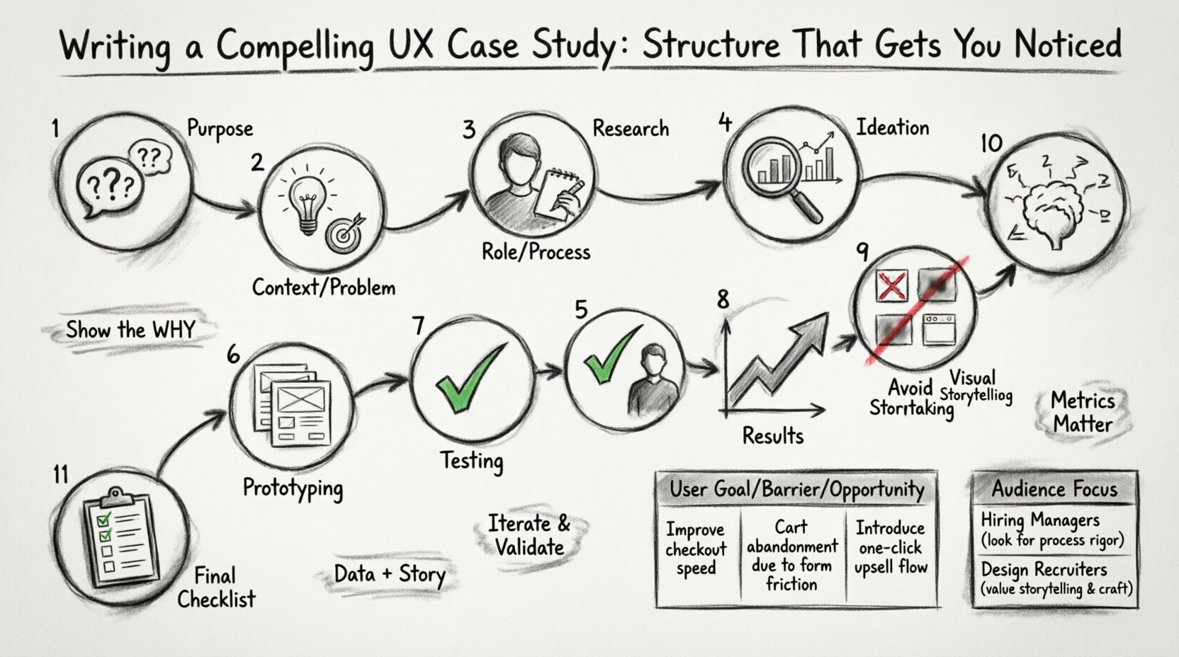
Understanding the Purpose of a UX Case Study 🧐
Before diving into the structure, it is crucial to understand the audience and the objective. A case study is a strategic document. It is designed to answer three core questions for the reader:
- What problem did you solve? Was it a business issue, a user frustration, or a technical constraint?
- How did you approach it? What methodology did you use to arrive at the solution?
- What was the outcome? Did the design improve metrics, satisfaction, or efficiency?
Many designers make the mistake of focusing solely on the final visuals. While aesthetics matter, the process is where the real value lies. Hiring managers want to see your workflow, your collaboration skills, and your ability to iterate based on feedback. The structure of your case study should guide the reader through this journey logically.
1. Setting the Context and Problem Statement 🌍
The beginning of your case study sets the stage. You must provide enough background information for the reader to understand the scope without overwhelming them with unnecessary details. A clear problem statement is the anchor of your entire narrative.
Define the Challenge
Start by describing the specific challenge you faced. Avoid vague statements like “I wanted to improve the app.” Instead, be specific. Did the user drop-off rate increase? Was there a confusion in the checkout flow? Did the client need to reduce support tickets? Clarity here demonstrates your ability to identify real issues.
- The Business Goal: What did the organization hope to achieve? Increased revenue, higher engagement, or cost reduction?
- The User Need: What was the user trying to accomplish that was currently hindered?
- The Constraints: Were there time limits, budget restrictions, or technical barriers?
Who Was Involved?
Contextualize the project. Mention the team size and your specific role. Were you the sole designer, or part of a larger product team? Did you work with engineers, product managers, and stakeholders? This establishes the complexity of the environment you operated in.
2. Showcasing Your Role and Process 🛠️
Once the problem is clear, explain your contribution. Ambiguity regarding your role can lead to confusion. If you worked on a team, specify which parts of the design process you owned.
Clarify Your Responsibilities
Be honest about your scope. If you only handled the UI, say so. If you conducted user interviews, highlight that. Transparency builds trust. Hiring managers prefer to know exactly what you brought to the table rather than assuming you did everything.
- Research: Did you lead user interviews or surveys?
- Design: Did you create wireframes, prototypes, or high-fidelity screens?
- Testing: Did you facilitate usability sessions?
- Handoff: Did you collaborate with developers to ensure implementation accuracy?
Outline the Methodology
Describe the framework you followed. Did you use a specific design thinking approach? Did you follow an agile workflow? You do not need to name specific software tools here, but you can reference standard practices.
For example, you might say, “We followed a double-diamond process to ensure we were solving the right problem before building the right solution.” This shows you understand the iterative nature of design.
3. Research and Discovery Phase 🔍
Good design is rooted in research. This section proves that your decisions were not based on gut feelings but on data and user insights. This is often the most critical part of the case study for senior roles.
Qualitative and Quantitative Data
Balance your evidence. Qualitative data tells the story (user quotes, pain points), while quantitative data confirms the scale (metrics, statistics).
- Interviews: Mention how many users you spoke to and what key themes emerged.
- Surveys: Did you gather feedback from a larger group to validate assumptions?
- Analytics: What did the data say about current performance? High bounce rates? Low conversion?
User Personas and Empathy Maps
Visualizing the user helps the reader understand who you were designing for. You do not need to show every detail, but include key takeaways from your research. What were the primary goals of the user? What were their frustrations?
Consider creating a table to summarize user needs versus current system limitations. This adds structure and readability to your text.
| User Goal | Current Barrier | Opportunity for Improvement |
|---|---|---|
| Complete purchase quickly | Too many steps in checkout | Streamline form fields |
| Find support information | Hidden in footer | Move to header navigation |
| Track order status | Unclear email notifications | Improve clarity of updates |
This visual aid allows the reader to scan the problem space quickly while you provide deeper context in the accompanying text.
4. Ideation and Prototyping 💡
Now that the problem is defined and the user is understood, how did you generate solutions? This section should show the evolution of your ideas, not just the final result.
Sketching and Concepting
Share early artifacts. Hand-drawn sketches or low-fidelity wireframes demonstrate your ability to think quickly and iterate. Show that you explored multiple directions before committing to one path.
Include a brief explanation of why certain concepts were discarded. This shows critical thinking. For instance, “Option A was visually appealing but increased cognitive load, so we pivoted to Option B for better clarity.”
Interactive Prototypes
Describe how you validated the flow. Did you create clickable prototypes to test navigation? Did you simulate the experience to check for timing issues? Mentioning the fidelity of the prototype helps the reader understand the stage of development.
- Low-Fidelity: Focus on layout and flow.
- Mid-Fidelity: Focus on hierarchy and interactions.
- High-Fidelity: Focus on visual polish and branding.
Remember to explain the tools used generically. Instead of naming a specific app, refer to “industry-standard prototyping software” or “collaborative design platforms.”
5. Testing and Validation ✅
Design is rarely perfect on the first try. This section highlights your humility and dedication to quality. It shows that you are willing to let go of your own ego in favor of what works for the user.
Usability Testing
Describe the testing process. How many participants were involved? What tasks did they perform? Did they encounter errors? What did you learn?
Be specific about the feedback received. “Users struggled to locate the search bar.” Then, explain how you addressed it. “We increased the contrast and moved the element to a more prominent position.”
A/B Testing and Iteration
If you had the opportunity to test live variations, mention it. A/B testing provides hard data on which design performs better. Even if you did not run a live test, discuss how you prioritized changes based on stakeholder feedback.
Use bullet points to list key iterations:
- Iteration 1: Initial wireframes tested with 5 users. Identified confusion in navigation.
- Iteration 2: Revised navigation structure. Improved task completion rate by 15%.
- Iteration 3: Visual polish and accessibility adjustments for final launch.
6. Results and Impact 📈
This is the most important section for business stakeholders. It answers the question: “Did it work?” You need to connect your design work to tangible outcomes.
Quantifiable Metrics
If available, use numbers. Metrics can include:
- Conversion Rate: Did more users complete the desired action?
- Time on Task: Did users finish tasks faster?
- Support Tickets: Did the number of help requests decrease?
- Retention: Did users come back more often?
If specific numbers are confidential, you can use percentages or general trends, such as “significant improvement” or “reduced friction.” However, concrete data is always preferable.
Qualitative Feedback
Numbers do not tell the whole story. Include quotes from users or stakeholders. “The new interface is much easier to use,” said a customer support agent. This adds a human element to your data.
7. Visual Storytelling and Layout 🖼️
How you present the information is just as important as the information itself. UX designers must practice what they preach regarding information architecture.
White Space and Whitespace
Do not crowd the page. Use ample white space to let the content breathe. This makes the case study feel professional and easy to scan.
Visual Hierarchy
Use headings, subheadings, and bold text to guide the eye. Large images should be accompanied by captions that explain what the reader is looking at. Do not expect the reader to guess the context of a screenshot.
- Captions: Always label your images. “Figure 1: The original checkout flow.”
- Annotations: Use arrows or callouts to highlight specific interactions in your screenshots.
- Diagrams: Flowcharts or journey maps help explain complex processes better than text alone.
8. Common Mistakes to Avoid ❌
To ensure your case study stands out, be aware of common pitfalls that undermine credibility.
- Lack of Context: Assuming the reader knows what the app is. Always provide a brief overview.
- Focus on Beauty Only: Showing only final high-fidelity screens without showing the messy middle.
- Jargon Overload: Using technical terms that obscure meaning. Keep language accessible.
- Missing the ‘Why’: Describing actions without explaining the reasoning behind them.
- Ignoring the Negative: Hiding failures. Admitting what went wrong and how you fixed it is often more impressive than a perfect record.
9. Tailoring for Different Audiences 🎯
Not all case studies are written for the same reader. You may need to adjust the focus depending on who is viewing your portfolio.
| Reader Type | Focus Area | Key Question |
|---|---|---|
| Product Manager | ||
| Design Lead | ||
| Developer |
Adjusting your narrative to address these specific concerns demonstrates emotional intelligence and professional maturity. It shows you understand the ecosystem in which design operates.
10. Writing Style and Tone ✍️
The voice of your case study should be professional yet engaging. Avoid passive voice where possible. Active voice conveys confidence and ownership.
- Passive: “The design was changed by the team.”
- Active: “The team revised the design.”
Keep paragraphs short. Large blocks of text are difficult to read on digital screens. Break up your content with lists, images, and headers. This improves the reading experience significantly.
11. Final Checklist for Your Portfolio ✅
Before publishing your case study, run through this final checklist to ensure quality and completeness.
- Is the problem clear? Can I understand the challenge in one sentence?
- Is my role defined? Do I know exactly what I contributed?
- Is the process visible? Did I show the research, ideation, and testing?
- Are there results? Do I have metrics or feedback to back up the success?
- Is it scannable? Can I get the gist by skimming the headers and images?
- Are images high quality? Are the screenshots clear and legible?
- Is the grammar correct? Typos reduce credibility immediately.
Building a Sustainable Design Narrative 🚀
Creating a compelling UX case study is a skill that improves with practice. It requires you to step back from the design itself and look at the work as a story. When you structure your documentation to highlight the problem-solving journey, you demonstrate that you are not just a pixel pusher, but a strategic thinker.
Remember that your portfolio is a living document. As you complete new projects, update your case studies with fresh insights or better visuals. The goal is to present a consistent body of work that reflects your growth and expertise over time. By adhering to a clear structure and focusing on evidence-based storytelling, you position yourself as a reliable professional ready to tackle complex challenges.
Take the time to refine each project. A single, well-documented case study is often more valuable than a portfolio filled with unfinished sketches. Focus on depth over breadth. Ensure every piece of content serves a purpose in answering the core questions of the reader. With a solid structure and authentic narrative, your work will speak for itself, opening doors to opportunities that align with your career aspirations.

