Designing digital products requires a clear vision before a single line of code is written or a final pixel is placed. At the heart of this vision lies the wireframe. It is the blueprint of the user experience, a skeletal structure that defines layout, hierarchy, and functionality without the distraction of color or detailed graphics. For designers looking to streamline their workflow, mastering the art of rapid wireframing is essential. This guide covers the fundamentals of creating low-fidelity sketches that communicate complex ideas quickly and effectively.
What Exactly Is a Wireframe? 🤔
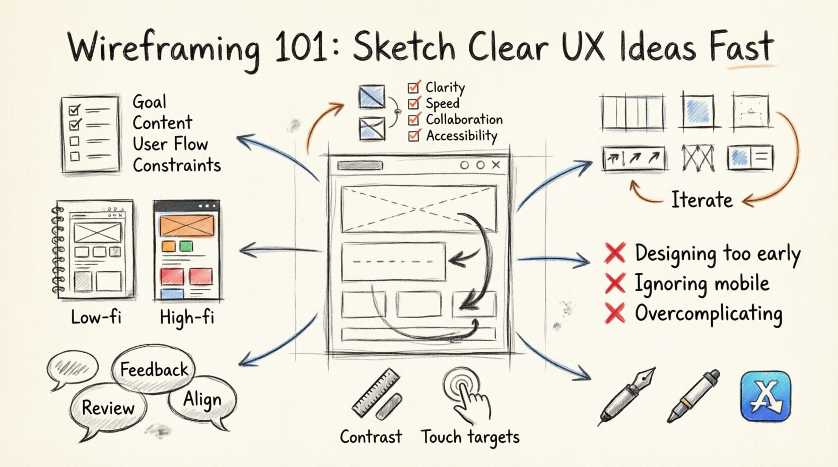
A wireframe is a visual guide that represents the skeletal framework of a website or application. Think of it as the architectural floor plan for a building. Just as an architect does not show the paint color or carpet choice in the initial blueprint, a wireframe does not include high-fidelity imagery, gradients, or typography. Instead, it focuses on:
- Structure: How information is organized on the screen.
- Layout: The placement of elements relative to one another.
- Functionality: How users will interact with the interface.
- Content: What text and media will appear in specific areas.
The primary goal is speed and clarity. By stripping away visual noise, you allow stakeholders and team members to focus on the flow of the experience. This approach prevents costly changes later in the development cycle. If you fix a navigation error in a sketch, it takes minutes. If you fix it after the code is written, it takes days.
Low-Fidelity vs. High-Fidelity: Knowing the Difference 📊
Understanding the distinction between fidelity levels is crucial for knowing when to stop sketching and when to start refining. Wireframing sits firmly in the low-fidelity category, but it acts as a bridge to high-fidelity designs.
| Feature | Low-Fidelity (Wireframe) | High-Fidelity (Prototype) |
|---|---|---|
| Visual Detail | Black and white, grayscale, or simple shapes | Full color, images, specific typography |
| Interaction | Static or basic click-through links | Complex animations and state changes |
| Purpose | Focus on structure and flow | Focus on look, feel, and usability |
| Time Required | Minutes to hours | Hours to days |
Starting with low fidelity ensures that you are not attached to a specific visual style before the structure is validated. It encourages honest feedback about the layout rather than comments on the color scheme.
Preparation: Before You Pick Up a Pen 📝
Jumping straight into drawing without context often leads to confusion. A successful sketch session requires groundwork. Here is how to prepare for a wireframing session effectively.
- Define the Goal: What problem is this screen solving? Is it a landing page, a dashboard, or a checkout flow? Knowing the objective guides the layout decisions.
- Gather Content: You cannot design a house without knowing the furniture. Collect the actual headlines, body copy, and images that will go into the design. Placeholder text helps, but real content reveals space constraints.
- Map User Flows: Sketch a simple path on paper showing how a user enters the system, performs an action, and exits. This prevents dead ends in your interface.
- Identify Constraints: Are there technical limitations? Do you need to support older browsers? Is there a specific mobile requirement? Write these down before you start.
The Sketching Process: Step-by-Step 🛠️
Once the preparation is complete, you are ready to create. The process can be done on paper, a whiteboard, or a digital canvas. The medium matters less than the discipline of the process.
1. Establish the Grid System 📐
Almost all successful interfaces rely on a grid. Even if you are sketching by hand, lightly mark out columns and margins. A standard grid often uses 12 columns for web layouts. This ensures alignment and consistency across different screens. Without a grid, elements will drift, and the design will feel unbalanced.
2. Sketch the Container Layout 🖼️
Start with the largest elements. Where does the header go? Where is the main navigation? Where is the primary call to action? Place the major containers first. Do not worry about the small details yet. Use boxes and lines to represent sections. This creates the skeleton of the page.
3. Define Hierarchy with Size and Placement 👁️
Users scan pages in an F-shaped or Z-shaped pattern. Place the most important information in these natural viewing zones. Use larger boxes for headlines and smaller boxes for body text. If a button is critical, make it prominent in the layout. Hierarchy tells the user what to look at first.
4. Add Navigation and Interactivity 🔄
Wireframes are not just static images; they represent interaction. Indicate where buttons lead. Use arrows to show flow between screens. If a user clicks a link, where do they land? Label these interactions clearly. This helps developers understand the logic behind the design.
5. Iterate and Refine 🔄
Your first sketch is rarely the best. Review it critically. Is there too much clutter? Is the navigation clear? Can a user complete the task without confusion? Make changes immediately. If you are using paper, use a fresh sheet. If digital, use a layer for changes. Iteration is the key to clarity.
Common Mistakes to Avoid 🚫
Even experienced designers fall into traps during the wireframing phase. Being aware of these pitfalls can save significant time.
- Designing Too Early: Do not worry about fonts or colors yet. This is a structure phase. If you focus on aesthetics too soon, you may lock in a layout that is structurally weak.
- Ignoring Mobile Constraints: Designing for desktop first and trying to squeeze it onto a phone later is a common error. Sketch mobile views early to understand space limitations.
- Overcomplicating the Layout: A wireframe should be simple. If it looks like a finished poster, you have gone too far. Keep it rough and functional.
- Skipping the User Flow: A single screen is rarely enough. Ensure you have mapped the sequence of screens required to complete a task.
- Ignoring Accessibility: Even in wireframes, consider contrast and spacing. Ensure buttons are large enough to tap and text is readable.
Collaboration and Feedback 🤝
Wireframes are excellent tools for collaboration. Because they are not polished, they invite critique. Stakeholders feel more comfortable suggesting changes to a rough sketch than to a beautiful final image. They perceive the work as unfinished, which reduces the psychological barrier to offering feedback.
When presenting your wireframes:
- Explain the Logic: Walk the viewer through the flow. Explain why elements are placed where they are.
- Focus on Function: Ask questions like, “Does this button achieve the goal?” rather than “Do you like the shape?”
- Document Changes: Keep version control. If you make changes based on feedback, label the new version. This prevents confusion about which iteration is current.
From Sketch to Prototype: The Transition 🚀
Once the wireframe is approved, it is time to move toward a higher fidelity. This transition should be seamless. The structure you established in the wireframe should remain the foundation of the final design. You will now add color, typography, and imagery, but the layout grid should not change drastically.
When handing off to developers, your wireframe serves as a reference for spacing and structure. It clarifies the intent behind the visual design. Annotations are helpful here. Use text notes to explain behavior that is not obvious from the image alone, such as hover states or error messages.
Tools for the Job 🧰
While specific software names are not necessary to discuss, understanding the categories of tools available helps in choosing the right environment.
- Pen and Paper: The fastest method. Ideal for brainstorming and early concepting. No setup time required.
- Digital Whiteboards: Great for remote collaboration. Allows multiple users to draw simultaneously from different locations.
- Vector Drawing Apps: Offers precision and the ability to reuse components. Useful for maintaining consistency across a large project.
- Specialized Wireframe Tools: Libraries of pre-made UI elements. These speed up the process by providing standard buttons, menus, and icons.
Accessibility in Wireframes ♿
Accessibility should not be an afterthought. It must be integrated into the wireframing stage. When sketching, consider the following:
- Focus States: Indicate where the user’s attention goes when tabbing through a form.
- Text Size: Ensure that the space allocated for text is sufficient for scaling without breaking the layout.
- Color Contrast: Even in grayscale, ensure there is enough difference between text and background to be readable.
- Touch Targets: Ensure interactive elements are large enough for touch input, especially for mobile devices.
Building a Library of Patterns 📚
Over time, you will notice patterns emerging in your designs. Navigation bars, search fields, and form inputs follow standard conventions. Building a library of these components speeds up the wireframing process. Instead of redrawing a standard header every time, you can reuse a component you have already validated.
This consistency benefits the user as well. Familiar patterns reduce the learning curve. When users recognize the layout, they can focus on the content rather than figuring out how to use the interface.
Measuring Success in Wireframing 📈
How do you know your wireframes are working? Look for these indicators:
- Faster Approval: Stakeholders sign off on the structure quickly because they understand the flow.
- Clearer Handoff: Developers have fewer questions about spacing and logic.
- Reduced Rework: Major layout changes are minimal during the development phase.
- User Testing Success: When tested, users can complete tasks without confusion in the prototype stage.
Final Thoughts on Efficiency ✅
Wireframing is a discipline of subtraction. It is about removing the unnecessary to reveal the essential. By focusing on clarity and structure, you create a solid foundation for any digital product. The time saved in the early stages pays dividends throughout the entire project lifecycle. Keep your sketches simple, your feedback loops tight, and your focus on the user journey.
Remember that the best wireframes are not always the prettiest. They are the ones that solve the problem most directly. As you practice, you will develop a personal style and workflow that fits your needs. The goal is not to create art, but to communicate ideas effectively. With these principles in mind, you can sketch clear, effective UX ideas fast and confidently.

