In the digital landscape, users do not read. They scan. 👀 Every second spent deciphering a layout is a second lost to engagement. Visual hierarchy is the architectural blueprint of user experience design. It dictates what a user sees first, what they notice next, and what they ultimately act upon. By organizing elements based on importance, designers guide the eye through content without forcing the user to stop and think.
Effective hierarchy reduces cognitive load. It transforms a chaotic wall of information into a structured narrative. When implemented correctly, the interface feels intuitive. The user understands the relationship between elements and the path to their goal becomes clear. This guide explores the mechanics of visual hierarchy, the psychological principles behind it, and practical strategies for implementation.
🧠 The Psychology of Scanning
Understanding how humans perceive information is the foundation of visual hierarchy. The brain processes visual data in milliseconds, relying on patterns to make sense of the world. In a digital environment, users employ specific scanning patterns to navigate screens efficiently.
1. The F-Pattern
Research into web usability shows that users often scan text-heavy pages in an F-shaped pattern. 👁️
- Top Horizontal: Users read across the top of the content area, usually capturing the logo and primary navigation.
- Second Horizontal: A second sweep occurs further down, often highlighting headings or subheadings.
- Vertical Scan: The eye moves down the left side, scanning for keywords and bullet points.
Placing key information along these lines ensures visibility. Critical data should not be hidden in the bottom right corner where the eye rarely rests.
2. The Z-Pattern
For landing pages or interfaces with less text and more visual elements, the Z-pattern is prevalent. 📍
- Top Left to Right: The eye starts at the logo and moves across to the primary call-to-action or value proposition.
- Diagonal Sweep: The gaze moves diagonally down to the center or secondary information.
- Bottom Right: The scan finishes at the bottom right, often where final actions or secondary links reside.
Designers must align the most important interactive elements along this Z-path to maximize conversion rates.
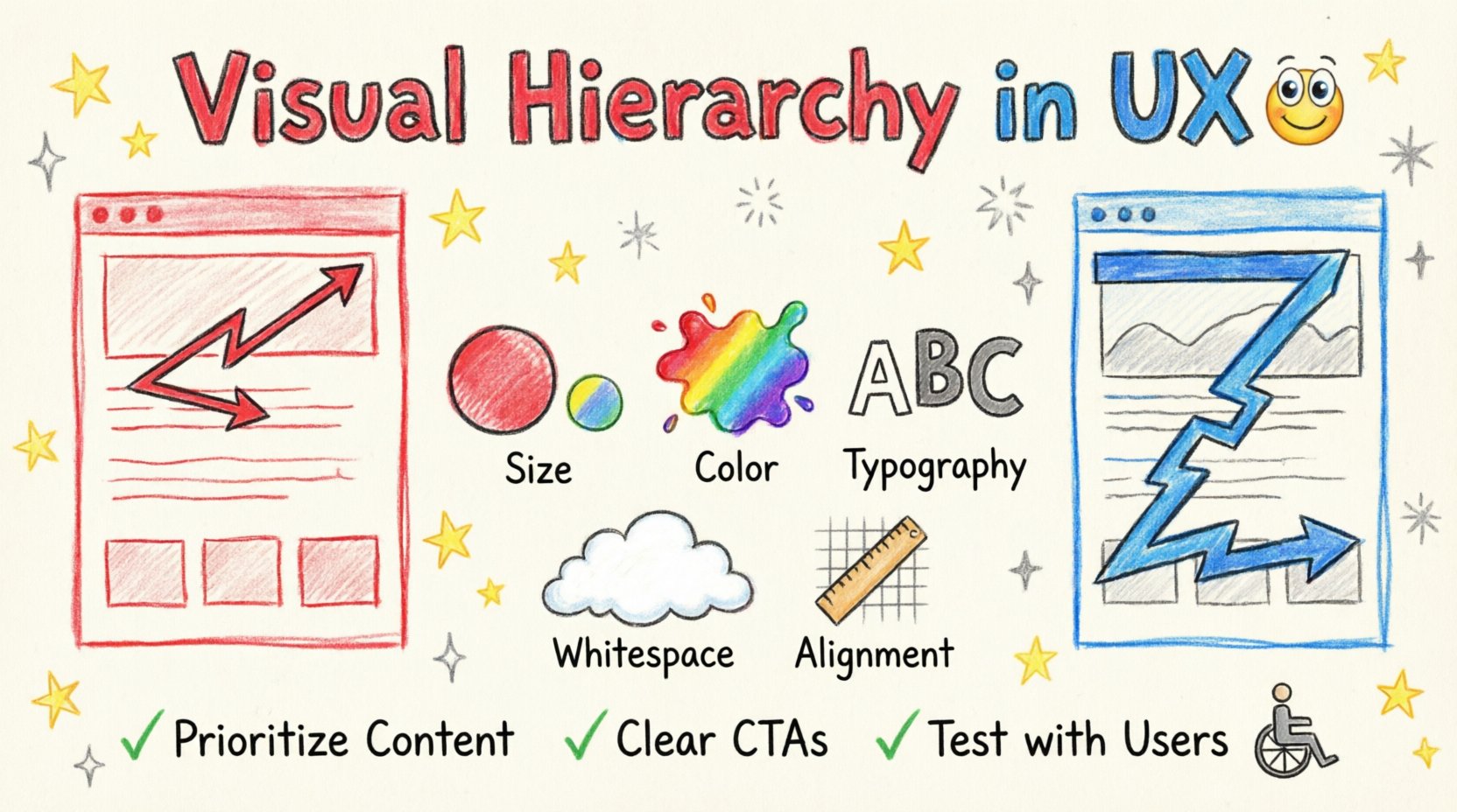
🛠️ The Building Blocks of Hierarchy
Visual hierarchy is constructed using specific design cues. Each cue signals importance to the user. Combining these cues creates a layered system of information.
1. Size and Scale
Size is the most immediate indicator of importance. 📏 Larger elements attract attention first. This applies to headlines, images, buttons, and icons.
- Headlines: The main title should be significantly larger than subheadings and body text.
- Images: Hero images or featured content should dominate the screen real estate.
- Buttons: Primary actions must be larger than secondary or tertiary actions.
Consistency is key. If all headlines are the same size, the hierarchy collapses. Use a scale system to maintain order.
2. Color and Contrast
Color draws the eye, but contrast directs it. 🎨 High contrast between an element and its background makes it stand out. Low contrast creates a sense of unity and background status.
- Accent Colors: Use a distinct color for primary calls-to-action (CTAs).
- Text Legibility: Ensure text has sufficient contrast against the background for readability.
- Emotional Association: Colors carry meaning. Red often signals danger or urgency, while green suggests success or safety.
Limit the palette. Too many competing colors dilute the hierarchy. Stick to a primary, secondary, and accent color scheme.
3. Spacing and Whitespace
Whitespace is not empty space; it is an active design element. ⏸️ It separates content and creates breathing room. Proper spacing groups related items and separates unrelated ones.
- Proximity: Items placed close together are perceived as related. This is the principle of grouping.
- Margins and Padding: Increase margins around primary content to isolate it from the frame.
- Rhythm: Consistent spacing creates a visual rhythm that guides the user down the page.
Overcrowding a layout creates visual noise. If everything is important, nothing is important. Use whitespace to highlight what matters.
4. Typography
Typeface choice and weight communicate tone and structure. 🔤
- Font Weight: Bold text stands out more than regular or light text.
- Font Style: Italics can indicate emphasis or secondary information.
- Typeface Variety: Using too many different fonts creates confusion. Limit to two or three typefaces.
Line height also affects hierarchy. Tighter line spacing suggests dense information, while loose spacing suggests premium or relaxed content.
5. Alignment
Alignment creates order. 📐 When elements align, the eye moves smoothly across the screen. Misalignment creates friction and draws attention to the error rather than the content.
- Left Alignment: Best for readability in languages that read left-to-right.
- Center Alignment: Often used for titles or short blocks of text to create balance.
- Grid Systems: Use a grid to ensure consistent alignment across the entire interface.
📊 Visual Cues Comparison
The following table summarizes how different visual cues function within a hierarchy.
| Cue | Function | Best Use Case | Caution |
|---|---|---|---|
| Size | Establishes primary importance | Headlines, Hero Images | Do not make everything large |
| Color | Directs attention to actions | Buttons, Links, Alerts | Ensure accessibility contrast |
| Spacing | Groups related content | Form fields, Cards, Sections | Avoid excessive gaps |
| Typography | Distinguishes content types | Headings, Body, Captions | Maintain readability |
| Placement | Leverages scanning patterns | Navigation, CTAs, Logos | Follow user expectations |
🔍 Implementation Strategies
Applying visual hierarchy requires a deliberate process. It is not enough to make things look pretty; the structure must serve the user’s intent.
1. Content Prioritization
Before designing, list the content. Identify what is essential and what is secondary. 📝
- Primary Goal: What is the one thing the user must do?
- Secondary Goal: What information supports the primary goal?
- Tertiary Content: What is nice to have but not critical?
Design the layout around the primary goal. Push secondary content to the periphery. Remove tertiary content if it clutters the experience.
2. Navigation Structure
Navigation is the roadmap of the interface. It should be consistent and predictable. 🗺️
- Primary Navigation: Place this at the top or side. Use clear labels.
- Contextual Navigation: Use breadcrumbs or links within content to show location.
- Footer Links: Use for legal information and secondary support.
Do not hide primary navigation behind complex menus. If a user cannot find where to go, they will leave.
3. Call-to-Action (CTA) Design
CTAs are the pivot points of the user journey. They must be unmistakable. 🎯
- Contrast: The button color should differ from the background.
- Text: Use action-oriented verbs like “Get Started” or “Download”.
- Whitespace: Surround the button with space to isolate it.
- Placement: Place CTAs where the eye naturally lands.
Test different variations to see which performs best. Ensure the button looks clickable through visual cues like shadows or borders.
♿ Accessibility and Inclusivity
Visual hierarchy is not just about aesthetics; it is about accessibility. Users with visual impairments rely on structure to navigate. 🌍
1. Color Blindness
Approximately 1 in 12 men have some form of color vision deficiency. 🎨
- Don’t rely on color alone: If a status message is red, add an icon or text label.
- Test Palettes: Check designs using color blindness simulators.
- Contrast Ratios: Ensure text meets WCAG contrast guidelines.
2. Focus States
Keyboard users need to know where they are on the page. ⌨️
- Focus Indicators: Use outlines or color changes when an element is selected.
- Tab Order: Ensure elements follow a logical reading order.
3. Scalable Text
Users may resize text in their browser settings. 📏
- Relative Units: Use ems or rems instead of fixed pixels.
- Flexible Layouts: Ensure the design breaks gracefully if text expands.
⚠️ Common Mistakes to Avoid
Even experienced designers can fall into traps that weaken hierarchy. Awareness of these pitfalls is crucial.
1. The “Everything is Important” Syndrome
When every element is bold, colorful, and large, none of them stand out. 🚫 Use restraint. Reserve strong visual cues for the most critical information.
2. Inconsistent Spacing
Random gaps confuse the user. If the margin between sections is 20px, do not use 35px for the next section. Establish a grid and stick to it. 📏
3. Ignoring Mobile Context
Desktop hierarchies do not always translate to mobile. 👆 On small screens, space is at a premium. Stack elements vertically. Prioritize the most critical content for the top of the fold.
4. Overusing Decorative Elements
Shadows, borders, and icons should serve a purpose. If an icon does not clarify meaning, remove it. 🗑️ Decorative clutter distracts from the hierarchy.
🔄 Testing and Validation
Design is an iterative process. What looks good on a screen may not work in reality. Validation is necessary. 🔍
1. Eye Tracking
While expensive, eye tracking technology provides direct data on where users look. 🧐 It reveals if the intended hierarchy matches the actual gaze path.
2. A/B Testing
Test different versions of a layout. 📊
- Change the size of a headline.
- Move a button to a different location.
- Adjust the color of a CTA.
Measure conversion rates and click-through data to determine which hierarchy performs better.
3. User Feedback
Ask users directly. 🗣️
- Can they find the main action?
- Is the content easy to read?
- Do they understand the relationship between elements?
Observation is often more telling than verbal feedback. Watch how they interact with the interface without intervention.
🌐 Future Considerations
The digital environment is evolving. Voice interfaces, augmented reality, and AI-driven designs are changing how hierarchy is perceived. 🤖
- Voice Interfaces: Hierarchy shifts from visual to auditory. The order of information becomes the order of speech.
- Augmented Reality: Spatial hierarchy matters. Elements must not obscure real-world context.
- Personalization: AI may adapt the visual hierarchy for individual users based on behavior patterns.
Despite these changes, the core principle remains: guide the user efficiently. The medium changes, but the need for clarity does not.
💡 Final Considerations
Visual hierarchy is the silent guide of the user experience. It works best when it is invisible. When a user completes a task without questioning the layout, the hierarchy has succeeded. It is a balance of art and science, psychology and structure.
By mastering the principles of size, color, spacing, and alignment, designers create interfaces that respect the user’s time and attention. The goal is not to decorate the screen, but to facilitate action. Start with the user’s goal, prioritize the content, and use visual cues to illuminate the path. This approach builds trust and drives engagement.
Remember, a well-structured interface is a respectful interface. It acknowledges that the user is busy and wants to achieve something specific. By making that achievement easy, the design adds value. Focus on clarity, consistency, and accessibility. These are the pillars of effective visual hierarchy.
As you design, constantly ask yourself: “What is the most important thing here?” Then, make it the most visible thing. This simple question, applied consistently, creates order out of chaos. It transforms a collection of pixels into a functional, usable, and effective tool for communication and action. Keep refining. Keep testing. Keep prioritizing. The result will be an interface that works for everyone.

