Every digital interaction is a conversation. When users navigate an application or visit a website, they are looking for answers, solutions, or a path forward. The text that appears on the screen is the voice of the product. This voice is carried by microcopy, the small but critical snippets of text that shape the user experience. From button labels to error messages, these words guide behavior and build trust. Understanding how to write effectively is essential for any design team aiming to create intuitive interfaces.
This guide explores the fundamentals of UX writing. We will look at why microcopy matters, how to structure it for clarity, and the principles that turn simple text into a helpful guide. Whether you are a designer, developer, or content strategist, these principles will help you create experiences that feel natural and responsive.
What Exactly Is Microcopy? 🧩
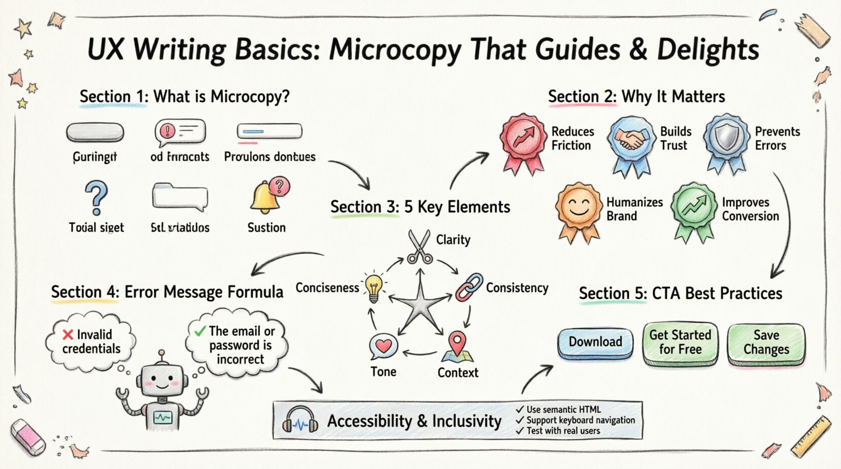
Microcopy refers to the short bits of text that guide users through a digital interface. It is not the headline on a landing page or the body text of a blog post. Instead, it is the text found in:
- Buttons and CTAs: Text that prompts action, such as “Sign Up” or “Add to Cart”.
- Error Messages: Notifications that tell users something went wrong and how to fix it.
- Form Labels and Placeholders: Instructions that clarify what information is required.
- Tooltips and Help Text: Small hints that explain a feature without cluttering the view.
- Empty States: Text that appears when a list is empty, guiding users on what to do next.
- Notifications: Alerts about system status or updates.
While each piece is small, the collective impact is significant. Users often scan interfaces rather than reading them. Microcopy must be concise, clear, and purposeful. It acts as a signpost, reducing cognitive load and preventing confusion.
Why Microcopy Matters in User Experience 🎯
Many teams focus heavily on visuals and functionality, treating text as an afterthought. However, text is the primary interface for accessibility and clarity. Good microcopy bridges the gap between what the system can do and what the user needs to do.
Here are the core reasons why this discipline is vital:
- Reduces Friction: Clear instructions prevent users from making mistakes before they start.
- Builds Trust: Polite and helpful language shows that the product cares about the user.
- Prevents Errors: Well-written validation messages stop users from submitting incorrect data.
- Humanizes the Brand: Tone and personality make a digital product feel like a service provided by people.
- Improves Conversion: Persuasive and clear calls to action encourage desired behaviors.
When text fails, users feel frustrated. They may abandon the process or assume the product is broken. When text succeeds, users feel supported and confident in their actions.
Key Elements of Effective UX Writing 📝
Creating great microcopy requires balancing brevity with clarity. You must convey necessary information without overwhelming the user. Below is a breakdown of the essential elements that define high-quality writing in interfaces.
| Element | Definition | Goal |
|---|---|---|
| Conciseness | Using the fewest words possible to convey meaning. | Respect the user’s time. |
| Clarity | Avoiding ambiguity and jargon. | Ensure immediate understanding. |
| Consistency | Using the same terms for the same actions. | Reduce learning curves. |
| Tone | The attitude or personality of the text. | Align with brand values. |
| Context | Writing that fits the specific situation. | Provide relevant help. |
1. Conciseness and Clarity
Users do not want to read essays. They want to know what to do. Shorter text is generally better, but it must still be complete. If you can say something in five words instead of ten, do it. However, never sacrifice clarity for brevity. A vague short sentence is worse than a slightly longer clear one.
- Bad: “Submit” (What does this submit?)
- Good: “Submit Application” (Clear action and object)
2. Consistency in Terminology
Confusion often arises when the same concept is referred to by different names. If you call it a “Profile” in one screen and “Account” in another, users may think they are different things. Establish a style guide early in the project to define standard terms.
3. Contextual Help
Text should appear when it is needed. A long list of instructions at the top of a form often goes unread. Instead, place help text directly next to the input field. This is known as inline validation or contextual guidance.
Writing Error Messages That Help, Not Blame 💡
Error messages are the most stressful part of a user journey. When something goes wrong, the user is already anxious. The text that appears at that moment determines whether they feel supported or attacked. The goal is to recover from the error, not to point out the user’s failure.
Principles for Error Messages
- Be Human: Avoid technical jargon like “Error 503” or “Null Pointer Exception.”
- Be Specific: Tell the user exactly what went wrong.
- Be Constructive: Offer a solution or next step.
- Be Polite: Avoid blaming language like “You forgot to enter…”
Examples of Transformation
| Scenario | Old Text (Avoid) | New Text (Use) |
|---|---|---|
| Login Failure | Invalid credentials. | The email or password is incorrect. |
| Empty Field | Field required. | Please enter your phone number. |
| Network Issue | Connection failed. | We couldn’t connect to the server. Check your internet. |
Notice how the new text explains the situation and offers a path forward. It removes the feeling of personal failure and focuses on the technical situation.
Crafting Clear Calls to Action (CTAs) 🚀
Buttons are the primary way users interact with content. The text on a button must be action-oriented. It should tell the user exactly what will happen when they click.
Best Practices for Button Text
- Use Action Verbs: Start with a verb. “Download,” “Register,” “Continue,” “Save.”
- Be Specific: “Get Started” is okay, but “Get Started for Free” is better.
- Avoid Passive Voice: “Click Here” is generic. “Read the Report” is specific.
- Maintain Brevity: Keep it short enough to fit on mobile screens without wrapping.
When a user sees a button, they need to know the outcome. If the text is vague, the user will hesitate. Hesitation leads to abandonment. Clarity leads to conversion.
Navigation and Labeling for Intuitiveness 🧭
Navigation labels are the map of your site. If the map is confusing, users get lost. Common labels like “Home” or “About” are understood by most, but custom labels can confuse users if they do not match their mental model.
Labeling Guidelines
- Use Familiar Terms: Users know “Search,” “Cart,” and “Profile.” Do not invent new words for common functions.
- Keep it Consistent: If you use “Help” in the header, do not use “Support” in the footer.
- Limit the Number: Too many navigation items overwhelm users. Group related items together.
- Test for Clarity: Ask someone who doesn’t know the product to explain what a label means.
Tone of Voice and Brand Personality 🗣️
Microcopy is a key channel for brand personality. A financial app might use a professional and reassuring tone. A gaming app might use playful and energetic language. The text should match the visual design and the overall brand identity.
Defining Your Tone
Before writing, define the characteristics of your voice. Is it:
- Professional: Formal, precise, trustworthy.
- Friendly: Casual, warm, approachable.
- Minimal: Direct, sparse, functional.
- Witty: Playful, humorous, engaging.
Once defined, apply these characteristics consistently across all microcopy. A sudden shift from formal to casual can feel jarring and unprofessional. Consistency builds a cohesive experience.
The Writing Process and Workflow ✍️
Writing for UX is not just about putting words on a page. It is an iterative process that involves research, drafting, and testing. It requires collaboration between designers, developers, and content specialists.
Steps to Follow
- Research: Understand the user’s needs and the business goals.
- Wireframing: Write text early in the design process, not after the visuals are done.
- Drafting: Create the copy based on the style guide.
- Review: Check for clarity, tone, and accuracy.
- Testing: Observe users interacting with the text.
- Iteration: Refine based on feedback and data.
Integrating writing into the design phase prevents the “lorem ipsum” problem, where generic filler text is used until the end. Real text reveals layout issues and helps designers make better decisions about space and hierarchy.
Testing and Optimization 📊
Writing is never truly finished. User behavior changes, and what works today might not work tomorrow. Testing microcopy is essential for long-term success.
Methods for Testing
- A/B Testing: Show different versions of a button or headline to see which performs better.
- User Testing: Watch users attempt tasks and note where they hesitate or get confused.
- Analytics: Monitor drop-off rates on forms or funnels.
- Accessibility Audits: Ensure text is readable by screen readers and meets contrast requirements.
Data provides objective evidence of what works. If a button labeled “Submit” has a lower click-through rate than “Get Started,” the data suggests the latter is more compelling. Let the users decide what works best.
Common Mistakes to Avoid ⚠️
Even experienced writers can fall into traps. Being aware of common pitfalls helps you maintain high standards.
1. Using Jargon
Industry terms may make sense to your team but confuse users. Avoid acronyms and technical slang unless your audience is highly specialized.
2. Passive Voice
Passive voice can make text feel distant and weak. Use active voice to create a sense of agency and action.
3. Vague Instructions
“Click here” tells the user nothing about the destination. “Read the Terms of Service” is much clearer.
4. Ignoring Mobile
Text that fits on a desktop screen might wrap awkwardly on a mobile device. Always check how text appears on smaller screens.
5. Inconsistent Grammar
Capitalization, punctuation, and tense should remain consistent. Do not mix “Sign In” and “sign in”.
Building a Content Style Guide 📘
To ensure consistency across a large product, a style guide is necessary. This document acts as the rulebook for all written content within the interface.
What to Include
- Terminology: Approved words for specific features.
- Tone: Examples of how the brand sounds.
- Grammar: Rules for punctuation and capitalization.
- Formatting: How to handle dates, numbers, and currency.
- Examples: Good and bad examples of copy.
Having this resource available to designers and developers ensures that everyone is writing to the same standard. It reduces revision time and prevents confusion.
Accessibility and Inclusivity ♿
Good UX writing is accessible writing. Text must be understandable by everyone, including users with disabilities. Screen readers read text aloud, so the wording must make sense when heard without context.
Accessibility Tips
- Descriptive Links: Instead of “Click here,” use “Download the PDF.”
- Alt Text: Describe images for users who cannot see them.
- Clear Headings: Use heading tags to structure content logically.
- Simple Language: Avoid complex sentence structures.
By prioritizing accessibility, you ensure that your product serves a wider audience. This is not just a legal requirement in many regions; it is a moral obligation to create inclusive digital spaces.
Final Thoughts on Microcopy Strategy 🌟
Microcopy is the small detail that makes a large difference. It is the difference between a confusing experience and a smooth one. By focusing on clarity, empathy, and consistency, you can turn text into a powerful tool for guiding users.
Remember that every word counts. Take the time to write carefully. Test your assumptions. Listen to your users. The result will be a product that feels intuitive and welcoming. In the digital world, words are the interface. Treat them with care, and they will work for you.
Start applying these principles today. Review your current interface for opportunities to improve. Replace vague text with clear instructions. Check your error messages for helpfulness. Small changes lead to significant improvements in user satisfaction and business outcomes.

