Design is often mistaken for the arrangement of pixels, colors, and typography. While these elements are the tools of the trade, the foundation of any successful user experience lies deeper. It resides in the human mind. Understanding how people perceive, process, and react to digital environments is the difference between a product that frustrates and one that feels intuitive. This guide explores the psychological principles that drive behavior, providing a framework for creating interfaces that align with natural human cognition.
When you design a screen, you are not just creating a layout; you are creating a path for a user’s thoughts. Every button, label, and interaction triggers a cognitive response. If this response is frictionless, the user flows. If it is blocked by confusion or unexpected behavior, they stop. To build systems that work, designers must understand the machinery behind the user’s mind.
Understanding Cognitive Load 🧠
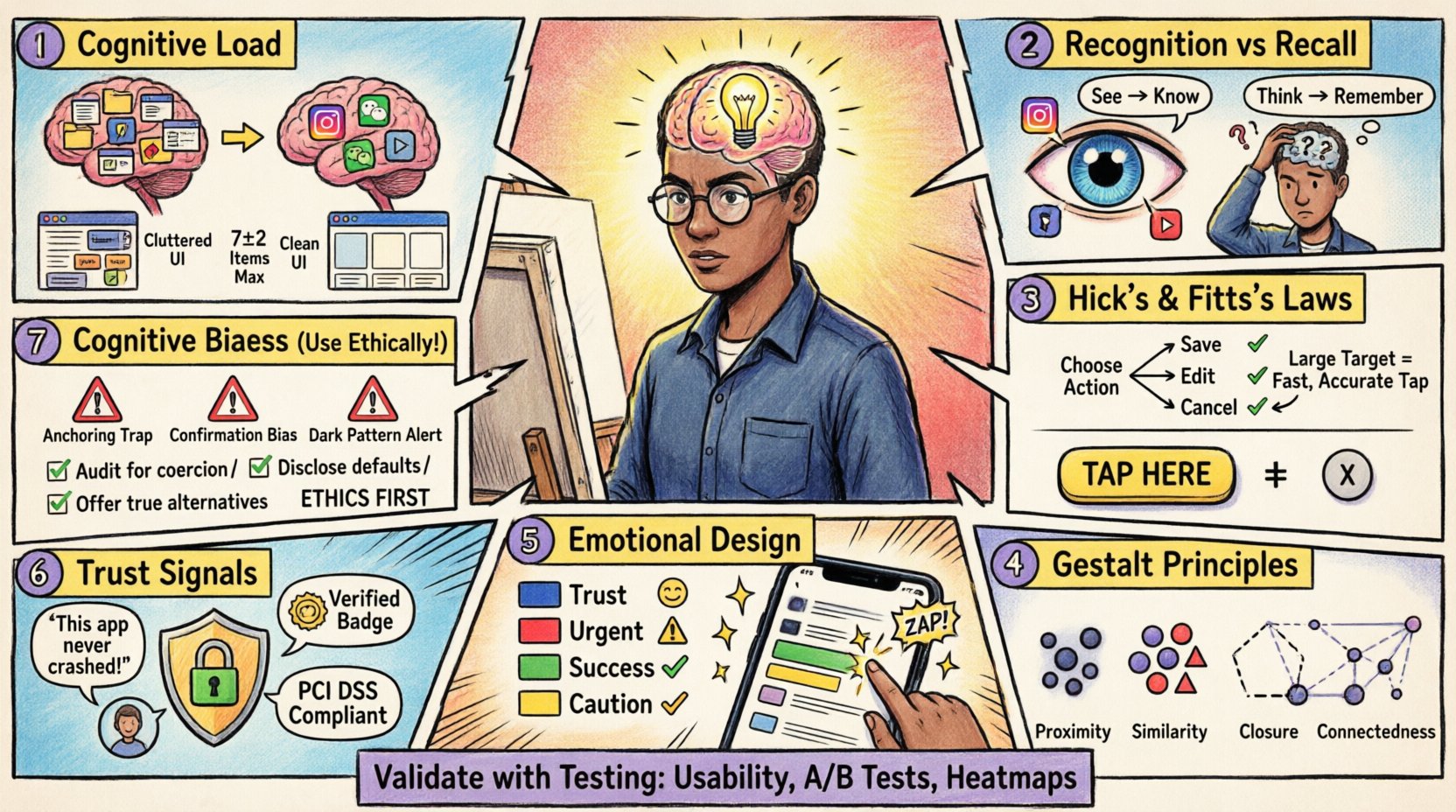
Cognitive load refers to the total amount of mental effort being used in the working memory. The human brain has a limited capacity for processing information. When a design demands too much attention, the user becomes overwhelmed, leading to errors or abandonment. Managing this load is the first step in good UX.
- Working Memory Limits: Research suggests that the average person can hold about seven items in their working memory at once. This is known as Miller’s Law. When a form asks for too much information on a single screen, it exceeds this capacity.
- Visual Clutter: Too many elements competing for attention dilute the focus. A clean interface reduces the need for the brain to filter noise.
- Chunking: Breaking information into smaller, manageable groups helps users process data faster. Phone numbers, for example, are easier to read when grouped (123-456-7890) rather than as a long string.
Practical application involves simplifying complex tasks. Instead of showing a user a massive dashboard with fifty metrics, prioritize the most critical data points. Use whitespace effectively to separate distinct sections. This visual breathing room signals to the brain that the content is organized and safe to process.
The Power of Recognition vs. Recall 👁️
One of the most significant distinctions in human memory is between recognition and recall. Recognition is the ability to identify something when presented with it. Recall is the ability to retrieve information from memory without cues. Recognition is significantly faster and less prone to error.
Designs that rely on recall place a heavy burden on the user. For instance, asking a user to type a command they cannot see, or remembering a specific color code to navigate, creates unnecessary friction. Instead, present options visibly.
- Navigation Menus: Visible navigation is better than hidden menus that require guessing. Icons with labels are better than icons alone.
- Forms: Use auto-complete features or dropdowns rather than requiring users to type exact values from memory.
- Iconography: Ensure icons are recognizable. A trash can means delete universally. Abstract shapes require learning and memorization.
This principle is closely tied to Jakob’s Law, which states that users spend most of their time on other sites. They expect your site to work like the sites they already know. Don’t reinvent the wheel for standard patterns. A shopping cart icon should always look like a cart. A magnifying glass should always search. Familiarity breeds comfort and speed.
Decision Making Laws ⚖️
Users make thousands of micro-decisions while interacting with a product. Psychology provides laws that predict how users choose between options. Applying these laws reduces friction and guides users toward desired actions.
Hick’s Law
Hick’s Law states that the time it takes to make a decision increases with the number and complexity of choices. Too many options lead to decision paralysis.
| Scenario | Bad Approach | Good Approach |
|---|---|---|
| Menu Selection | Showing 50 categories at once | Grouping into 5 main categories |
| Color Picker | Showing all 16 million colors | Showing 12 popular presets |
| Checkout | Asking for all details upfront | Progressive disclosure of steps |
Fitts’s Law
Fitts’s Law predicts the time required to rapidly move to a target area. It is a function of the distance to the target and the size of the target. Large targets that are close are easy to hit. Small targets that are far away are difficult to hit.
- Button Size: Primary actions should be larger than secondary actions. This visual weight signals importance and ease of interaction.
- Touch Targets: On mobile devices, buttons must be large enough to accommodate a finger. A standard minimum is 44×44 pixels to prevent mis-taps.
- Edge Placement: Targets placed at the edges or corners of a screen are easier to hit because the cursor stops there naturally.
Consider the placement of critical controls. If a “Save” button is small and buried in a text field, users will struggle. If it is a large button at the bottom of the screen, it becomes the natural path.
Gestalt Principles of Perception 🧩
Gestalt psychology describes how the human brain perceives visual patterns. We do not see individual lines; we see shapes. We do not see scattered dots; we see a circle. Leveraging these principles helps organize complex interfaces into coherent structures.
- Proximity: Objects that are close together are perceived as a group. Use spacing to indicate relationships. A header and its paragraph should be closer than the header and the next section.
- Similarity: Elements that look similar are perceived as having the same function. Use consistent colors for all links, or consistent shapes for all buttons.
- Closure: The brain fills in missing information to create a complete shape. This allows for minimalist icons where only parts of a shape are drawn, yet the meaning is clear.
- Continuity: The eye prefers to follow lines and curves. Use alignment to guide the user’s eye through the content flow.
These principles are invisible rules that structure the user’s understanding. When you violate them, the interface feels disjointed. For example, if a list of items is spaced randomly, the user cannot easily scan them. Consistent alignment and spacing create a visual rhythm that guides the eye effortlessly.
Emotional Design & Aesthetics 🎨
Functionality is not enough. Users form emotional attachments to products. The way a product looks influences how it is used. This is known as the Aesthetic-Usability Effect. Users with pleasing interfaces perceive them as easier to use, even if the underlying functionality is the same as a uglier version.
- Color Psychology: Colors evoke emotions. Blue often signifies trust and stability. Red signals urgency or error. Green suggests success or safety. Use these associations intentionally.
- Micro-interactions: Small animations provide feedback. A button that depresses when clicked confirms the action. A loading spinner that dances makes waiting feel less tedious.
- Tone of Voice: The text used in the interface contributes to the personality. A friendly, helpful tone reduces frustration during errors. A robotic tone increases anxiety.
Don’t sacrifice usability for beauty, but do not sacrifice beauty for utility. A beautiful interface invites the user in. A functional but ugly interface feels like a tool to be endured. The goal is to blend the two so the experience feels effortless and enjoyable.
Trust & Credibility Signals 🤝
Trust is the currency of digital interaction. Users must feel safe sharing data or making purchases. Trust is built through consistency, transparency, and authority.
- Consistency: Inconsistent branding or layout erodes trust. If the header changes on every page, the user wonders if the site is legitimate.
- Security Indicators: Lock icons, HTTPS, and clear privacy policies reassure users. Do not hide these; make them visible where sensitive data is entered.
- Social Proof: Reviews, testimonials, and user counts validate the value of the product. Seeing others use the service reduces the perceived risk.
- Error Handling: How a system handles mistakes defines credibility. A generic “Error 404” is cold. A helpful message that suggests a fix builds confidence.
Trust is fragile. One bad experience can break it. Ensure that the system behaves predictably. If a process takes time, tell the user. If data is being saved, show a progress bar. Transparency reduces anxiety and builds a stronger relationship between the user and the product.
Common Cognitive Biases ❌
Biases are systematic patterns of deviation from norm or rationality in judgment. Designers must be aware of these to avoid manipulating users negatively, or to use them to guide behavior ethically.
- Confirmation Bias: Users seek information that confirms their existing beliefs. If a user thinks a feature is broken, they will ignore evidence that it works. Design must provide clear evidence of functionality.
- Anchoring: The first piece of information offered acts as an anchor. The first price shown influences the perception of value. Use this to highlight the best value option first.
- Sunk Cost Fallacy: Users continue a behavior because they have already invested time or money. Don’t trap users in a flow they cannot escape. Provide clear exit paths.
- Endowment Effect: Users value things more highly once they own them. Allow users to customize or “claim” items to increase their perceived value.
Awareness of these biases helps in creating ethical designs. Avoid dark patterns that trick users into actions they didn’t intend. Instead, use psychology to reduce friction and clarify choices. This builds long-term loyalty rather than short-term gains.
Validating Your Design ✅
Psychology is theoretical until tested. What you assume works in your head might not work for the user. Validation is the process of checking your design against reality.
- Usability Testing: Watch users interact with the design. Note where they hesitate, click incorrectly, or express confusion. This reveals gaps in your psychological assumptions.
- A/B Testing: Test two variations of a design element to see which performs better statistically. This removes personal bias from the decision.
- Heatmaps: Visual representations of where users click and scroll help identify areas of high engagement or confusion.
- Feedback Loops: Create mechanisms for users to report issues. Direct feedback often highlights psychological barriers that testing might miss.
Design is iterative. It is a cycle of hypothesis, test, and refine. Never assume you know how a user feels. Ask them. Observe them. Let their behavior guide your psychological adjustments.
Building for the Future 🚀
The landscape of technology changes, but human psychology remains largely constant. While screens may evolve from phones to glasses, the cognitive limits of the brain do not shift overnight. The principles of memory, attention, and perception are enduring.
As a designer, your role is to act as a bridge between human needs and digital possibilities. You are the advocate for the user. You ensure that technology serves them, rather than forcing them to serve the technology.
- Empathy: Put yourself in the user’s shoes. Consider their context, their stress levels, and their goals.
- Curiosity: Keep learning about psychology. Read books on behavioral science. Stay updated on new research.
- Humility: Accept that your design might not be perfect. Be willing to change it based on evidence.
By grounding your work in these core psychological principles, you create experiences that feel natural. Users will not notice the design, but they will feel the result. They will feel understood, supported, and capable. That is the true mark of excellent UX.
Start by auditing your current projects. Look for cognitive overload. Check for recognition vs recall issues. Ensure your buttons are big enough. Apply these principles systematically. The impact on user satisfaction will be immediate and measurable.

