Designing a digital product involves more than just making things look good. It requires a solid foundation that ensures users can find what they need without confusion. This foundation is known as Information Architecture, or IA. At its core, IA is the structural design of shared information environments. It dictates how content is organized, labeled, and navigated across a platform. When done correctly, users move through a site or application intuitively. When done poorly, frustration mounts and engagement drops.
Organizing content effectively is not a one-time task. It is a continuous process that evolves alongside user needs and business goals. This guide explores the essential components of Information Architecture, providing a clear path to creating structures that support user experience. We will look at the principles, methods, and strategies required to build a robust framework for digital products.
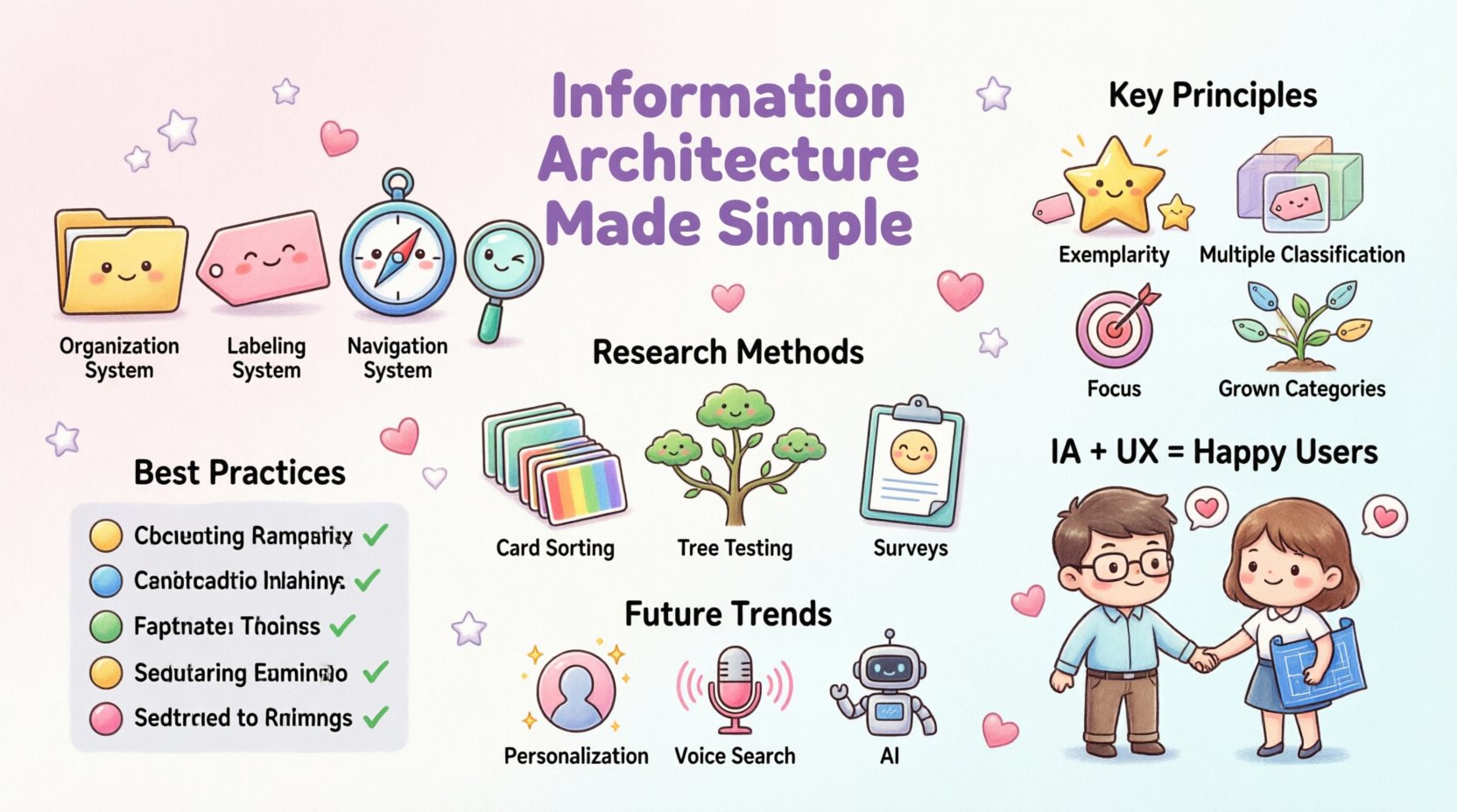
Understanding the Core of Information Architecture 🧱
Before diving into the mechanics, it is vital to understand what Information Architecture actually achieves. It serves as the blueprint for the entire digital experience. Just as a building needs a floor plan to function, a website needs a logical structure to be usable. IA defines the relationship between different parts of a system and how they interact with one another.
Several key pillars support this discipline:
- Organization Systems: How information is grouped and categorized.
- Labeling Systems: The words and images used to represent content.
- Navigation Systems: The mechanisms used to move through the structure.
- Search Systems: The tools that help users find specific items.
These four pillars work together to create a cohesive environment. If one pillar is weak, the entire structure may become unstable. For instance, having a great navigation system is less effective if the labels within it are confusing. Similarly, robust search tools cannot compensate for a disorganized content library.
Principles of Effective Content Organization 📂
Creating a logical structure requires adherence to established principles. These guidelines help designers make consistent decisions when arranging content. Below are the fundamental rules that drive successful information architecture.
1. Principle of Exemplarity
Every category should contain examples that represent the whole. If a section is labeled “Products,” the items within it must be clearly relevant to that label. Users should be able to predict what they will find based on the name of the section. This predictability builds trust and reduces cognitive load.
2. Principle of Multiple Classification
Content often belongs to more than one category. A single product might be relevant to “Kitchen,” “Appliances,” and “New Arrivals.” A good structure allows for this flexibility. While the primary path should be clear, secondary paths ensure users can discover content through different mental models. This approach mirrors how humans naturally think about information.
3. Principle of Focus
Every category must have a clear focus. If a section tries to cover too many disparate topics, it becomes confusing. Keep categories distinct and specific. If a category becomes too broad, it should be split into smaller, more manageable subcategories. This granularity helps users drill down to exactly what they need.
4. Principle of Grown Categories
Categories should not be created in isolation. They must fit within the broader context of the site. As content grows, new categories may need to be added. The structure must be scalable. A rigid structure that cannot accommodate growth will eventually break under the weight of new information.
Methods for Researching User Needs 🧐
Building a structure based on assumptions is a common pitfall. To create an architecture that truly works, you must understand how users think. This requires research. There are several methods to uncover these mental models.
Card Sorting
Card sorting is a primary method for understanding categorization. In this exercise, participants are given cards containing content items. They are asked to group these cards into categories that make sense to them. They may also be asked to name the categories. This process reveals how users expect information to be grouped.
There are two main types of card sorting:
- Open Card Sorting: Participants create their own categories. This is best for the early stages of design when the structure is undefined.
- Closed Card Sorting: Participants sort items into pre-defined categories. This is useful for validating an existing structure.
Tree Testing
Once a structure is proposed, tree testing validates its usability. This method strips away visual design and focuses solely on the hierarchy. Participants are given specific tasks, such as “Find the return policy,” and must navigate through the text-based structure to complete the task. This highlights navigation issues that might be hidden by good design.
Interviews and Surveys
Direct feedback from users provides qualitative data. Asking users about their tasks and how they currently search for information can reveal gaps in the current architecture. Surveys allow for broader data collection regarding user preferences and terminology.
Building the Structure: Taxonomy and Navigation 🧭
Once research is complete, it is time to build the actual structure. This involves defining the taxonomy and planning the navigation paths. These elements are the visible representation of the architecture.
Developing a Taxonomy
Taxonomy is the science of classification. In digital contexts, it refers to the hierarchy of content. A well-designed taxonomy ensures that every piece of content has a specific place. It prevents duplication and ensures consistency.
Consider the following taxonomy levels:
- Level 1: Top-level categories (e.g., Home, About, Services).
- Level 2: Sub-categories (e.g., Services > Web Design, Services > SEO).
- Level 3: Specific content pages (e.g., Web Design > Case Studies).
Limiting the depth of this hierarchy is crucial. Users should not have to click more than three or four times to reach deep content. This is known as the “three-click rule,” though it is a guideline rather than a hard law. The goal is to minimize effort.
Navigation Patterns
Navigation is how users traverse the structure. Common patterns include:
- Global Navigation: Links that appear on every page, providing access to major sections.
- Local Navigation: Links specific to a section, helping users navigate within that context.
- Contextual Navigation: Links based on the current content, suggesting related items.
- Breadcrumbs: A trail showing the user’s location within the hierarchy, allowing easy return to previous levels.
Consistency is key. Navigation should remain in the same place across the site. Users should not have to relearn how to move around as they browse different pages.
Labeling Systems and Terminology 🏷️
Even with a perfect structure, users cannot find content if they do not understand the labels. Labels are the signs that guide users through the architecture. Choosing the right words is a critical part of the process.
Labels should be simple and concise. Avoid jargon or internal terminology that users do not recognize. If the business calls a section “Synergistic Solutions,” users might expect “Services” or “Consulting.” The label must match user language.
Here are best practices for labeling:
- Use Familiar Words: Test labels with users to ensure they understand them.
- Be Consistent: Do not use different words for the same concept (e.g., “Contact” vs. “Get in Touch”).
- Keep it Short: Long labels can clutter navigation and overwhelm users.
- Be Descriptive: Ensure the label accurately reflects the content within.
Common Pitfalls in Information Architecture ⚠️
Even experienced designers can make mistakes when organizing content. Recognizing these common pitfalls can help avoid frustration and rework later in the process.
1. Over-Engineering
Creating a complex structure with too many categories often leads to confusion. Users prefer simplicity. If a user has to choose between ten options to find one thing, they will likely give up. Simplify the structure whenever possible.
2. Ignoring Search
While navigation is important, search is a vital tool. Some users prefer to type exactly what they want rather than browse. Ignoring search functionality or making it difficult to use can alienate these users. Ensure search results are relevant and the interface is intuitive.
3. Inconsistent Hierarchy
If one section has five subcategories and another has twenty, the experience feels unbalanced. Maintain a consistent depth and breadth across the site. This consistency helps users build a mental map of the site.
4. Lack of Maintenance
Content grows over time. Old content may become obsolete, or new content may require new categories. Failing to audit and update the architecture leads to a cluttered and outdated structure. Regular reviews are necessary to keep the system healthy.
Testing and Validation 🔍
Building the structure is only half the battle. You must test it to ensure it works for real people. Validation confirms that the design meets user needs and business goals.
Usability Testing
Watch users attempt to complete tasks using the prototype or live site. Observe where they hesitate, where they click incorrectly, and where they express confusion. This data is invaluable for refining the architecture.
Analytics Review
Once the site is live, data tells the story of user behavior. Look at high bounce rates on specific pages. Check search terms that return no results. These indicators suggest areas where the architecture may be failing to support user intent.
Comparison Table: IA Methods
| Method | Best Used For | Key Benefit |
|---|---|---|
| Card Sorting | Defining categories | Reveals user mental models |
| Tree Testing | Validating hierarchy | Tests structure without design bias |
| Surveys | Gathering broad feedback | Quantitative data on preferences |
| Analytics | Post-launch optimization | Identifies real-world usage patterns |
Content Strategy and Governance 📝
Information Architecture does not exist in a vacuum. It is closely tied to content strategy. This involves planning the creation, delivery, and governance of content. Without a strategy, content can become scattered and inconsistent.
Content Inventory
Before restructuring, conduct a full inventory of existing content. List every page, file, and asset. This inventory helps identify redundancies, outdated material, and gaps. It provides a clear picture of what needs to be moved or removed.
Content Audits
Regular audits ensure content remains relevant. Check for broken links, outdated information, and content that no longer aligns with business goals. A clean content library supports a cleaner architecture.
Governance Policies
Establish rules for how content is added and managed. Who has permission to create new categories? What standards must content meet before publication? Governance ensures that the architecture remains stable as the team grows.
The Relationship Between IA and User Experience 🤝
Information Architecture is a subset of User Experience (UX). It is the invisible layer that makes the visible design possible. Good UX relies on good IA. If users cannot find the content, the design does not matter.
When IA is strong, the following benefits occur:
- Reduced Support Costs: Users find answers themselves, reducing help desk tickets.
- Increased Engagement: Easy navigation encourages users to explore more.
- Higher Conversion: Users reach product pages or contact forms faster.
- Improved Accessibility: Logical structures are easier for assistive technologies to navigate.
Conversely, poor IA creates barriers. Users leave sites that are confusing. They cannot complete tasks. They perceive the brand as disorganized. Therefore, investing time in structure is investing in the overall success of the product.
Future Trends in Information Architecture 🚀
The digital landscape is constantly changing. New technologies and behaviors influence how we organize information. Staying aware of trends helps keep architectures relevant.
- Personalization: Structures may adapt based on user history. Different users might see different navigation paths based on their needs.
- Voice Search: As voice assistants grow, labels must be optimized for spoken queries. This requires a focus on natural language and questions.
- Multimedia Integration: Content is no longer just text. Video, audio, and interactive elements require new ways of categorization and tagging.
- AI and Automation: Algorithms can suggest categorizations and predict user paths. However, human oversight remains essential to ensure accuracy and empathy.
Summary of Best Practices ✅
To summarize, creating a successful Information Architecture requires a methodical approach. It starts with understanding the user and ends with continuous improvement. Follow these core takeaways to guide your work:
- Start with research to understand user mental models.
- Use clear, simple labels that match user language.
- Keep the hierarchy shallow and logical.
- Test the structure before and after launch.
- Plan for growth and maintain the system regularly.
- Collaborate with content strategists and developers.
- Focus on usability over aesthetic complexity.
By prioritizing the structure of information, you create an environment where users feel confident and capable. They can achieve their goals without unnecessary friction. This freedom is the essence of a positive user experience. Remember, the goal is not just to organize content, but to organize it in a way that serves the human being on the other side of the screen.
Investing in Information Architecture pays dividends in reduced support costs, higher satisfaction, and better business outcomes. It is a foundational discipline that supports all other aspects of digital design. When the structure is solid, the design can shine.

