In the complex landscape of organizational operations, clarity is often the first casualty. Processes drift, steps get added, and communication breaks down without anyone noticing until a deadline is missed. Business Process Model and Notation (BPMN) offers a standardized way to visualize these flows. It is not just a drawing tool; it is an analytical instrument designed to expose the mechanics of work.
Using BPMN to identify inefficiencies requires a shift in perspective. You are not merely documenting what happens; you are actively hunting for where things go wrong. This guide provides a deep dive into leveraging BPMN symbols, structure, and logic to find bottlenecks, reduce waste, and streamline operations.
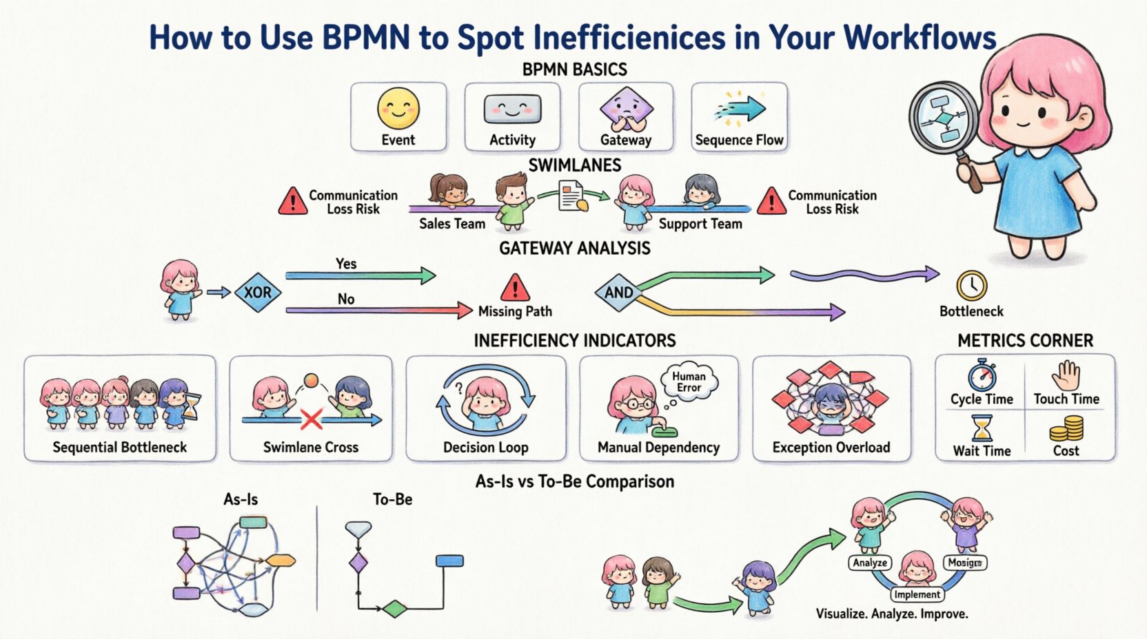
1. Understanding the Language of Process 🏗️
Before identifying problems, you must understand the syntax. BPMN is a visual language. If you do not speak it fluently, you will miss the subtle signs of dysfunction. The notation relies on a set of standardized shapes that convey specific meanings about the state of a task or a decision.
Think of a BPMN diagram as a blueprint for a building. You would not build a skyscraper without checking the load-bearing walls. Similarly, you should not run a business process without verifying the decision gates and handoff points. When you map a process, you create a single source of truth. This truth allows you to measure, analyze, and improve.
- Events: Circles that mark the beginning, middle, or end of a process.
- Activities: Rectangles that represent work being performed.
- Gateways: Diamonds that control the flow path based on logic.
- Sequence Flows: Arrows that show the order of operations.
2. The Cost of Invisible Handoffs 🔄
One of the most common sources of inefficiency is the transfer of responsibility. In a diagram, this appears as a movement from one swimlane to another. Swimlanes group activities by the role or department responsible for them. When a task moves from one lane to another, information must be translated.
This translation is where errors occur. People misunderstand requirements. Files get lost in email threads. Decisions are made without the right context. By visualizing these handoffs, you can count them.
High-Handoff Risk Indicators:
- Multiple sequential handoffs between different roles.
- Tasks that sit idle in a different swimlane for long periods.
- Complex connections requiring physical movement of documents.
- Lack of clear input/output definitions between lanes.
If you see a process that requires five different people to touch a single request before it is complete, you have a high risk of delay. Each touchpoint is a potential failure point.
3. Analyzing Gateways for Logic Traps ⚙️
Gateways dictate the path of the process. They are the decision points. Inefficient processes often suffer from poor logic design at these junctions. There are two main types of gateways you need to scrutinize: Exclusive and Parallel.
Exclusive Gateways (The XOR)
These represent a decision where only one path is taken. For example, “Is the order approved?” If yes, go to shipping. If no, go to review.
Inefficiency Signs:
- Missing Paths: What happens if the answer is neither yes nor no? If a path is missing, the process halts.
- Complex Conditions: If the logic requires looking up three different databases to make one decision, the task is too heavy.
- Looping: If the “No” path leads back to the same task without changing the state, you have an infinite loop.
Parallel Gateways (The AND)
These represent simultaneous work. For example, “Start background check AND send email notification.”
Inefficiency Signs:
- Unbalanced Synchronization: If one parallel path takes 1 minute and the other takes 1 day, the whole process waits for the 1-day task. This is a bottleneck.
- Unnecessary Parallelism: If tasks do not depend on each other but are forced to run in parallel, resources are wasted.
4. Detecting Latency Through Events ⚡
Events mark time. A Start Event begins the timer. An Intermediate Event might happen in the middle. An End Event stops it. By analyzing the distance between these circles, you can identify where time is lost.
Intermediate Events: These are often where delays hide. A timer event, for instance, might indicate a waiting period. If you see a timer event waiting for 3 days before the next task, ask why.
Manual vs. Automated Tasks: Distinguish between tasks that require human input and those that are system-driven. Manual tasks often have higher variability. If a process relies on a human to click a button every hour, that is a risk. Automation reduces the variability of time.
5. The Problem of Exceptions 🛑
Most process maps show the “Happy Path.” This is the flow where everything goes right. Real life, however, involves errors. Inefficiencies often hide in how exceptions are handled. A robust BPMN model includes error flows.
Look for the boundary events attached to tasks. These represent interruptions. If a task fails, what happens? Does the process stop? Does it restart? Does it go to a manager?
Exception Analysis Checklist:
- Is there a defined path for failure?
- Are exceptions handled by the same person who caused them?
- Does the error handling path add significant complexity to the diagram?
- Are there multiple exception paths that converge on a single “fix” task?
If you see a complex web of error handling, it indicates that the primary process is fragile. You should aim to stabilize the primary flow so exceptions are rare.
6. Data Objects and Information Flow 📄
Process is not just action; it is the movement of data. Data objects in BPMN represent information required or produced by a task. Inefficiency occurs when data is duplicated or transformed unnecessarily.
Data Redundancy: If the same data is entered in three different tasks, you have a waste of effort. This often happens when departments do not share a common system.
Data Transformation: If a task involves converting a PDF to a spreadsheet, then copying to an email, then uploading to a database, you have a heavy process. Each conversion introduces a risk of error.
7. A Comparative Table of Inefficiencies 📉
To help structure your analysis, use this table to compare common process flaws with their visual indicators in BPMN.
| Inefficiency Type | BPMN Visual Indicator | Impact | Remediation Strategy |
|---|---|---|---|
| Sequential Bottleneck | Many tasks in a single line | High Cycle Time | Parallelize where possible |
| Swimlane Cross | Frequent lane changes | Communication Loss | Consolidate roles |
| Decision Loop | Gateway returning to previous task | Infinite Delay | Refine decision logic |
| Manual Dependency | User Task with no automation | Human Error | Automate input/output |
| Exception Overload | Complex boundary event web | Process Fragility | Stabilize core flow |
8. The “As-Is” vs. “To-Be” Analysis 📝
One of the most powerful ways to spot inefficiencies is to create two models. The first is the “As-Is” model. This captures exactly how work is done today, including all the hacks and workarounds. The second is the “To-Be” model. This is how work should be done ideally.
By comparing the two, the gaps become obvious. You might find that the “As-Is” model has 15 tasks, while the “To-Be” model has 8. The difference is the inefficiency.
Steps for Comparison:
- Map the Reality: Interview the people doing the work. Do not trust the official manual.
- Identify Non-Value Add: Mark tasks that do not move the goal forward. These are waste.
- Redesign the Flow: Remove the waste. Combine the steps.
- Validate the Logic: Ensure the new flow still meets all requirements.
9. Best Practices for Process Maintenance 🔄
Creating a diagram is not a one-time event. Processes evolve. New regulations appear. Technology changes. To keep spotting inefficiencies, you must maintain the model.
Version Control: Keep track of changes. If a process changes, the diagram must update. An outdated diagram is dangerous because it guides people based on false information.
Regular Audits: Schedule a review of the process every quarter. Ask the question: “Has anything changed since the last review?” This keeps the model relevant.
Stakeholder Validation: Show the diagram to the people doing the work. If they say, “This is not how we do it,” you have a problem. The diagram must match reality.
10. The Role of Metrics in BPMN 📏
Visuals are great, but numbers are better. BPMN models can be annotated with metrics. These metrics provide quantitative evidence of inefficiency.
Key Metrics to Track:
- Cycle Time: How long from start to finish?
- Touch Time: How long is the work actually being done?
- Wait Time: How long does the task sit idle?
- Cost per Transaction: How much does it cost to complete the process?
When you combine the visual map with these numbers, you have a powerful diagnostic tool. You can point to a specific gateway and say, “This decision point adds 2 hours to the cycle time.” That is a specific target for improvement.
11. Dealing with Complex Dependencies 🔗
Some processes are inherently complex. They involve multiple systems, external partners, and varying conditions. In these cases, the BPMN diagram can become a mess. This mess is often a sign of inefficiency.
If a diagram requires a zoom level of 50% to see all the details, it is too complex. You need to simplify. Use sub-processes to group related tasks. A sub-process is a task that contains its own internal flow. This hides complexity until you need to see it.
Sub-process Benefits:
- Reduces visual clutter on the main diagram.
- Allows you to focus on high-level logic first.
- Enables you to drill down into specific areas of inefficiency.
12. The Human Element in Process Design 👥
Finally, remember that processes are designed by humans for humans. An efficient process on paper might fail in practice if it ignores human behavior. BPMN helps you visualize the flow, but you must also consider the cognitive load.
If a user has to make a decision based on 10 different variables, they will make mistakes. Simplify the decision logic. If a task requires reading a 50-page document, that is a barrier. Break the task down or provide better tools.
Human-Centric Questions:
- Does this task require focus that is interrupted by noise?
- Is the information presented clearly at the point of use?
- Are the roles clearly defined and understood?
13. Continuous Improvement Cycle 🔄
Spotting inefficiencies is the first step. The second is fixing them. This requires a cycle of analysis, design, implementation, and monitoring. It is not a linear path. It is a loop.
1. Analyze: Use BPMN to find the problem. 2. Design: Create a new model that solves the problem. 3. Implement: Change the work to match the new model. 4. Monitor: Check if the problem is gone.
Repeat this loop. Inefficiency is not a one-time fix. It is a constant state that requires vigilance.
14. Summary of Key Takeaways 📌
Using BPMN to spot inefficiencies is a disciplined approach to operations. It requires patience, attention to detail, and a willingness to question the status quo. By focusing on handoffs, gateways, events, and data, you can uncover the hidden costs of your workflows.
Core Principles:
- Visualize the flow to see the waste.
- Focus on the handoffs between roles.
- Question every decision point and exception.
- Use metrics to validate the visual findings.
- Keep the model updated to reflect reality.
When you master this visual language, you gain the ability to see the invisible. You see where time is wasted and where value is created. This clarity is the foundation of operational excellence.

