Design is not merely about aesthetics; it is a discipline rooted in observation, logic, and empathy. Many aspiring and seasoned professionals alike struggle with the plateau that follows initial learning. The gap between knowing the theory and executing it fluently is bridged by consistent, deliberate practice. This guide outlines specific, actionable exercises designed to refine your craft without relying on software tutorials or complex tools.
The goal here is not to create perfect interfaces overnight, but to sharpen the mental muscles required to solve problems effectively. By integrating these habits into your daily routine, you build a reservoir of intuition that serves you when complex challenges arise. We will explore exercises focusing on layout, typography, accessibility, and user psychology, ensuring a holistic approach to skill development.
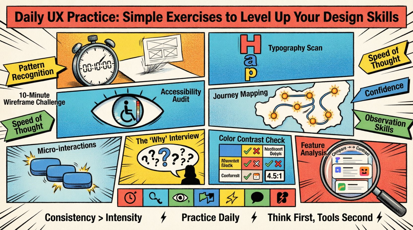
Why Daily Practice Matters in UX 🧠
Consistency outweighs intensity in creative fields. Spending ten minutes every day on a specific skill yields better long-term results than a marathon session once a month. The human brain learns through repetition and neural pathway reinforcement. When you practice UX principles daily, you stop thinking about the rules and start seeing the patterns.
- Pattern Recognition: Frequent exposure to good and bad design helps you identify effective solutions faster.
- Speed of Thought: Exercises that require quick decisions improve your ability to iterate during real-world projects.
- Confidence: Regular engagement reduces the fear of the blank canvas.
- Observation Skills: You begin to notice details in the physical world that translate to digital interfaces.
These exercises require no specific software licenses. You can use paper, a whiteboard, or any drawing tool available to you. The focus is on the thinking, not the rendering.
1. The 10-Minute Wireframe Challenge ⏱️
Wireframing is the backbone of user experience design. It forces you to prioritize content over decoration. The exercise is simple: take a common digital task, such as logging into a service or adding an item to a cart, and sketch the layout in ten minutes.
Objective
To practice information architecture and layout efficiency under time pressure.
Methodology
- Define the Goal: What is the single most important action the user must take?
- Set a Timer: Ten minutes is strict. This prevents over-polishing.
- Skip Details: Do not worry about fonts, colors, or images. Use boxes and lines.
- Focus on Flow: Ensure the eye moves naturally from top to bottom.
Common Pitfalls
- Adding decorative elements before establishing structure.
- Ignoring mobile constraints by designing for a wide screen only.
- Focusing on the “happy path” and ignoring error states.
Repeating this daily trains your hand to translate abstract ideas into concrete spatial arrangements quickly.
2. Typography Hierarchy Scan 📝
Typography dictates how users read and consume content. Poor hierarchy leads to cognitive overload. This exercise involves analyzing existing interfaces to understand how type establishes importance.
Objective
To develop an eye for scale, weight, and spacing that guides user attention.
Methodology
- Find a Source: Open a news site, an app, or a dashboard.
- Identify Levels: Locate the H1, H2, H3, and body text.
- Map the Scale: Note the font sizes and weights used for each level.
- Check Contrast: Ensure the body text is distinct from the headings.
Key Principles to Observe
- Proportion: Headings should be significantly larger than body text.
- Weight: Bold text signals importance, but use sparingly.
- Line Height: Adequate spacing between lines improves readability.
- Color: Text color should support the hierarchy, not fight it.
After analyzing, try to recreate a small section using a pen on paper, strictly adhering to the scale you observed.
3. Accessibility Audit Simulation ♿
Accessibility is not an afterthought; it is a fundamental requirement. This exercise trains you to view designs through the lens of diverse abilities.
Objective
To identify barriers that prevent users from interacting with content effectively.
Methodology
- Select an Interface: Choose a website or app you use frequently.
- Simulate Low Vision: Blur your screen or view it from a distance.
- Check Color Contrast: Look for text that blends into the background.
- Test Keyboard Navigation: Try to tab through the interface without using a mouse.
Checklist for Audits
- Are all interactive elements distinguishable without color alone?
- Is there sufficient padding around clickable targets?
- Can you understand the content without sound?
- Are form labels clear and associated correctly?
Performing this weekly ensures that inclusivity remains a priority in your workflow rather than a compliance checkbox.
4. User Journey Mapping from Memory 🗺️
Understanding the user’s path is critical. This exercise removes the reliance on data and forces you to rely on empathy and logic.
Objective
To practice visualizing the end-to-end experience of a user.
Methodology
- Choose a Task: Example: Booking a flight or ordering food.
- List Steps: Write down every action from start to finish.
- Identify Emotions: Note where the user might feel anxious, confused, or happy.
- Spot Friction: Highlight steps where the user might drop off.
Visualizing the Map
- Start Point: The trigger that initiates the task.
- Touchpoints: Screens, emails, or physical interactions involved.
- End Point: The successful completion of the task.
- Feedback Loops: How does the system confirm the action?
Doing this helps you see the ecosystem surrounding a single interface, ensuring you design for the whole context.
5. Micro-interaction Sketching ✨
Micro-interactions are the small moments that make a product feel alive. They provide feedback and clarify system status.
Objective
To design clear, functional feedback mechanisms for user actions.
Methodology
- Identify an Action: Such as liking a post, submitting a form, or toggling a switch.
- Sketch States: Draw the “before,” “during,” and “after” states.
- Animate (Mental): Visualize the motion. Is it instant? Does it bounce?
- Consider Error: What happens if the action fails?
Examples of Micro-interactions
- A button changing color on press.
- A loading spinner that indicates progress.
- A success message that appears briefly.
- A haptic feedback sensation (imagined).
Focusing on these details elevates the perceived quality of the product significantly.
6. The “Why” Interview 🗣️
Designers often propose solutions before understanding the problem. This exercise shifts the focus to inquiry.
Objective
To practice asking probing questions that reveal root causes.
Methodology
- Find a Scenario: Imagine a user complaint or a business request.
- Ask “Why”: Ask the question five times to drill down to the core need.
- Record Answers: Write down the response to each “Why”.
- Reframe: Turn the final insight into a design opportunity.
Example Scenario
- Request: “I want a big red button here.”
- Why? “Because it needs to stand out.”
- Why? “Because users miss the call to action.”
- Why? “Because the current text is too small and blends in.”
- Why? “Because the design prioritizes image over text.”
- Insight: The design needs to balance visual weight, not just add color.
- Why? “Because the design prioritizes image over text.”
- Why? “Because the current text is too small and blends in.”
- Why? “Because users miss the call to action.”
- Why? “Because it needs to stand out.”
7. Color Contrast & Readability Check 🎨
Color is a powerful tool, but it must serve legibility. This exercise focuses on ensuring text is readable across different environments.
Objective
To ensure text remains legible under various lighting and visual conditions.
Methodology
- Grayscale Test: Convert your design to black and white.
- Blur Test: Apply a Gaussian blur to the text.
- Distance Test: View the design from three feet away.
- Simulate Color Blindness: Use a filter to view the design as a colorblind user might see it.
Standards to Keep in Mind
- Ratio: Text should maintain a contrast ratio of at least 4.5:1 against the background.
- Size: Smaller text requires higher contrast to be readable.
- Background: Avoid textured backgrounds behind text.
8. Competitor Feature Analysis 📊
Understanding the market landscape is essential for creating relevant solutions.
Objective
To learn from existing solutions and identify gaps in the market.
Methodology
- Select Competitors: Choose three similar products.
- Feature List: List the core features of each.
- Comparison: Identify which features are common and which are unique.
- Pros & Cons: Note what works well and what feels clunky in each.
What to Look For
- Navigation structures.
- Onboarding flows.
- Payment methods.
- Help and support options.
This analysis helps you avoid reinventing the wheel while identifying opportunities for innovation.
Structuring Your Daily Routine 📅
Integrating these exercises into a busy schedule requires planning. Below is a suggested weekly schedule to ensure variety and consistency.
| Day | Focus Area | Exercise Type | Duration |
|---|---|---|---|
| Monday | Layout | 10-Minute Wireframe | 10 mins |
| Tuesday | Typography | Hierarchy Scan | 15 mins |
| Wednesday | Accessibility | Audit Simulation | 20 mins |
| Thursday | Research | Journey Mapping | 20 mins |
| Friday | Interaction | Micro-interaction Sketch | 15 mins |
| Saturday | Empathy | The “Why” Interview | 30 mins |
| Sunday | Analysis | Competitor Feature Analysis | 30 mins |
This schedule ensures you touch upon every critical aspect of UX design without burnout. You can adjust the timing based on your availability, but the order of topics helps maintain a balanced skill set.
Measuring Progress 📈
How do you know if these exercises are working? Progress in design is often subtle, but it can be tracked through specific indicators.
- Speed: Are you able to sketch ideas faster than before?
- Clarity: Do your sketches convey intent more clearly to others?
- Confidence: Do you feel less anxious when starting a new project?
- Feedback: Do peers or mentors provide less corrective feedback on fundamentals?
- Portfolio: Are your case studies more focused on the process and problem-solving?
Keep a journal of your daily practice. Write down what you learned, what felt difficult, and what you would do differently next time. This reflection solidifies the learning process.
Common Obstacles to Consistency 🚧
Even with a solid plan, obstacles will arise. Recognizing them early allows you to navigate around them.
1. Lack of Time
Work and life demand energy. If you cannot find thirty minutes, break the exercises down. A five-minute wireframe is better than no wireframe. Consistency is about showing up, not the duration.
2. Perfectionism
Do not judge the output of your practice session. The goal is to practice the skill, not to produce a masterpiece. Embrace the rough edges of your sketches.
3. Burnout
If you feel exhausted, take a break. Rest is part of the creative process. Return to your practice when you feel refreshed.
4. Isolation
Share your exercises with a peer. Discussing your journey mapping or wireframes with someone else provides new perspectives and keeps you accountable.
The Role of Tools in Practice 🛠️
While digital tools are essential for production, they can sometimes hinder the learning process. They offer shortcuts that bypass critical thinking.
- Templates: Using a template saves time but reduces the understanding of grid systems.
- Auto-layout: This automates spacing but hides the logic of alignment.
- Components: Reusing components is efficient but can limit exploration of variation.
During your daily practice, limit the use of these features. Force yourself to draw lines, place boxes manually, and define spacing yourself. This builds a foundational understanding that makes you a better user of any tool later.
Building a Design Library 📚
As you complete these exercises, curate a personal library of your work. This is not a portfolio for clients, but a reference for yourself.
- Categorize: Group sketches by type (e.g., Forms, Navigation, Dashboards).
- Annotate: Write notes on what worked and what didn’t for each piece.
- Review: Look back at your work from three months ago to see your growth.
This library becomes a tangible record of your evolving skills and serves as a reminder of your dedication to the craft.
Final Thoughts on Skill Development 🌱
Growth in UX design is a marathon, not a sprint. There is no shortcut to understanding human behavior and translating it into digital solutions. The exercises outlined here provide a framework for steady improvement.
By focusing on the fundamentals daily, you build a robust toolkit that serves you regardless of the specific software or trends of the moment. The ability to think clearly, structure information logically, and empathize with users is what defines a great designer.
Commit to the process. Show up every day. Sketch, analyze, and question. Over time, these small actions compound into significant professional capability.

