Every successful software project rests on a foundation of data. However, the bridge between technical data structures and business objectives is often where projects stumble. This gap is frequently filled by Entity Relationship Diagrams (ERDs), yet they remain a source of confusion for many. An ER diagram is not just a technical artifact; it is a communication tool. When designed with clarity, it transforms abstract database logic into a visual story that stakeholders can understand.
This guide explores how to craft ER diagrams that serve as a universal language between data architects and business leaders. We will move beyond syntax and symbols to focus on clarity, intent, and effective visual communication. By the end of this reading, you will have a framework for creating diagrams that facilitate decision-making rather than hinder it.
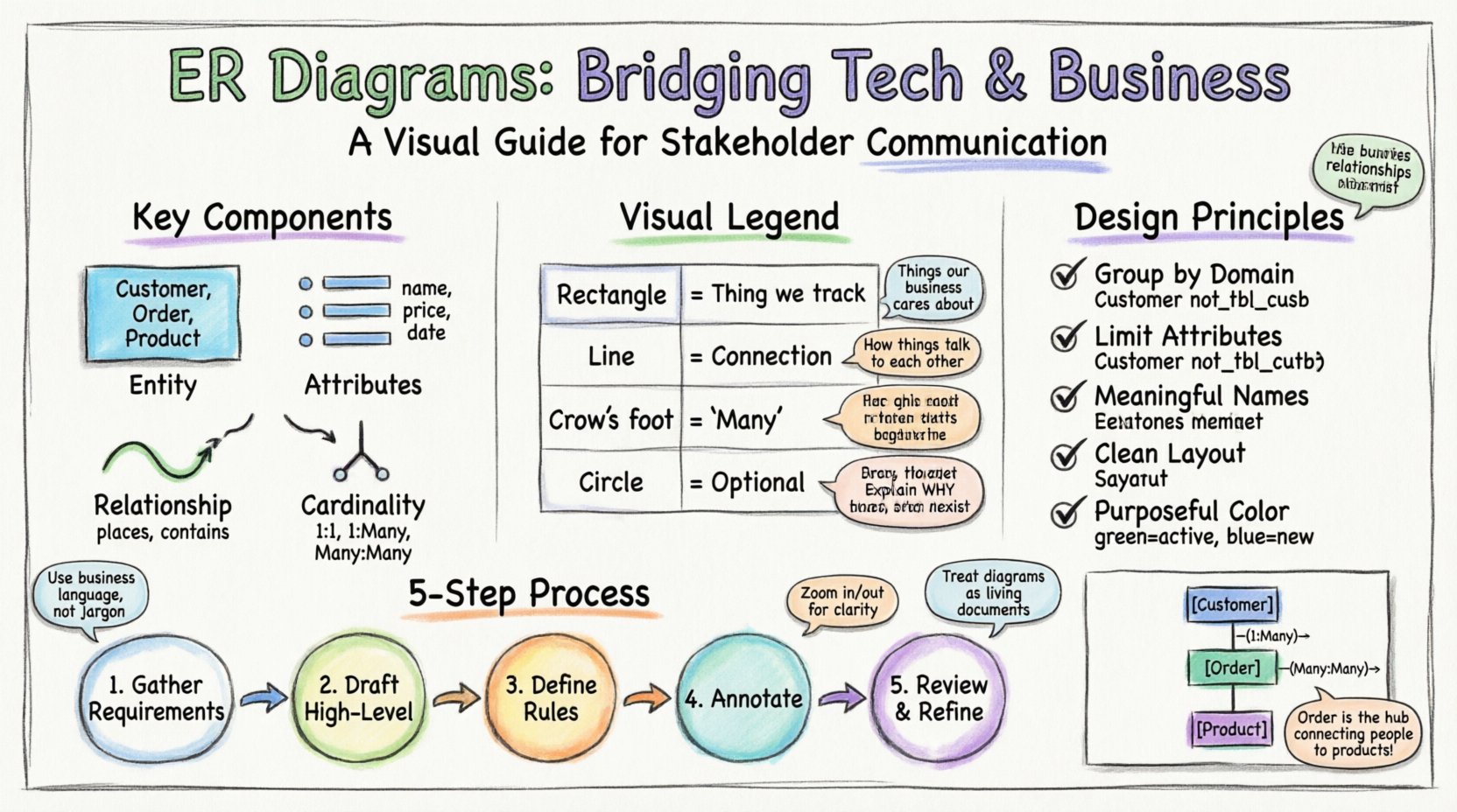
Understanding the Entity Relationship Diagram 🧩
An Entity Relationship Diagram is a visual representation of the structure of a database. It maps out the entities (objects or concepts), the attributes (properties of those objects), and the relationships (how objects interact) that define the data landscape. While developers rely on these diagrams to write code, business stakeholders rely on them to validate requirements.
Think of an ERD as a blueprint for a building. An architect draws it for the contractor, but the client needs to see the floor plan to understand where the rooms are. If the blueprint is too technical, the client cannot verify if the design meets their needs. Similarly, if an ER diagram is too dense, stakeholders cannot validate the data model.
Key components include:
- Entities: These represent the core objects, such as Customer, Product, or Order. In a diagram, these are typically represented by boxes.
- Attributes: These are the specific details belonging to an entity, like a Customer Name or Product Price. These are usually listed within the entity box or connected via lines.
- Relationships: These define how entities interact, such as a Customer placing an Order. These are shown as connecting lines.
- Cardinality: This defines the quantity of relationships, such as one-to-many or many-to-many. This is often visualized using “crow’s foot” notation.
Why Stakeholders Struggle with Data Models 🤯
Non-technical stakeholders often possess a deep understanding of business processes but lack familiarity with database normalization or schema design. When presented with a raw ER diagram, several barriers to understanding emerge:
- Abstraction Levels: Technical diagrams often include primary keys and foreign keys. To a business user, these are meaningless identifiers that obscure the actual meaning of the data.
- Jargon Overload: Terms like “normalization,” “referential integrity,” or “junction tables” create immediate cognitive friction.
- Visual Clutter: A diagram that tries to show every single attribute for every single entity becomes unreadable at a glance.
- Lack of Context: Without annotations explaining *why* a relationship exists, the diagram appears arbitrary.
The goal is not to dumb down the data, but to translate the technical reality into business value. The diagram should answer the question: “Does this structure support the way we do business?”
Decoding the Visual Language 🗣️
To communicate effectively, you must use standard notation, but you must also interpret it. Below is a reference for the most common symbols found in entity relationship diagrams. Understanding these is crucial for guiding a discussion with non-technical users.
| Symbol | Visual Representation | Meaning | Stakeholder Explanation |
|---|---|---|---|
| Rectangle | 🟦 | Entity | A specific thing we are tracking (e.g., a User). |
| Line | ──── | Relationship | A connection or action between two things. |
| Crow’s Foot (Three lines) | ⫍ | Many | One of these can connect to multiple of the other. |
| Single Line / Dash | — | One | Only one instance of this is allowed. |
| Circle / Dot | ○ | Optional | This connection is not required for the record to exist. |
When presenting this table to a group, walk through the “Stakeholder Explanation” column. This bridges the gap between the symbol and the business rule it represents.
Principles of Stakeholder-Centric Design 🎨
Designing for humans requires a different approach than designing for machines. A machine cares about optimization; a human cares about comprehension. Adhere to these principles when creating your diagrams.
- Group by Domain: Do not list all tables in a single row. Group related entities together. For example, put all billing tables in one cluster and all user management tables in another.
- Limit Attributes: Do not list every single column. Show the primary key and the most critical identifiers. You can provide a detailed attribute list as an appendix or separate document.
- Use Meaningful Names: Avoid technical abbreviations. Use Customer instead of tbl_cust. Use Order Date instead of ord_dt.
- Minimize Crossing Lines: A tangled web of lines indicates complexity. Re-arrange the nodes to create a clean, flowing layout. If lines cross, use orthogonal routing (right-angle turns) to reduce visual noise.
- Color with Purpose: Use color to highlight status or importance. For instance, green for entities that are active, red for those that are deprecated, or blue for new features under discussion.
Step-by-Step Creation Process 🛠️
Creating a clear diagram is a methodical process. It begins before you open any diagramming software.
1. Gather Requirements
Before drawing a single box, speak with the business users. Ask them how they currently track information. What are the critical questions they need the system to answer? This ensures the diagram reflects reality, not just technical preference.
2. Draft the High-Level Model
Start with the major entities only. Focus on the high-level relationships. Get approval on the main structure before diving into sub-tables. This prevents stakeholders from getting bogged down in details too early.
3. Define Cardinality Rules
Work through the logic of relationships. Can a user exist without an account? Can an order exist without a customer? Document these rules clearly. Cardinality is often the most confusing part for non-technical users, so spend extra time here.
4. Annotate Heavily
Add text boxes explaining complex relationships. If a relationship is complex (like a many-to-many join table), explain why it exists in a note. For example: “This table tracks which products were in which order, allowing us to report on historical sales.”
5. Review and Refine
Conduct a “walkthrough” session. Point to an entity and ask the stakeholder to describe what it is. If they hesitate, the label is unclear. If they misunderstand the relationship, the line notation is confusing. Iterate until the conversation flows smoothly.
Handling Cardinality and Relationships 🔄
Cardinality is the mathematical backbone of data integrity, but it is also the most abstract concept for business users. It dictates the business rules of the system.
- One-to-One (1:1): One record in Table A links to exactly one record in Table B. Example: A Person has one Passport.
- One-to-Many (1:N): One record in Table A links to multiple records in Table B. Example: One Customer places Many Orders.
- Many-to-Many (M:N): Multiple records in Table A link to multiple records in Table B. This usually requires a third “bridge” table. Example: Students and Courses. A student takes many courses; a course has many students.
When explaining Many-to-Many relationships, avoid technical terms like “junction table.” Instead, use the analogy of a “linking list” or a “middleman.” Explain that the system needs a separate list to track exactly which student is in which class, because the student list and class list don’t know about each other directly.
Common Pitfalls in Data Visualization ⚠️
Avoid these common mistakes that can derail communication during reviews.
- Over-Engineering: Do not show every possible normalization step. If a stakeholder needs to see data about an address, do not show the separate Street, City, and State tables unless it is critical for the discussion. Show the Address entity and group the attributes inside.
- Inconsistent Notation: Switching between Chen notation and Crow’s Foot notation within the same document creates confusion. Stick to one standard throughout.
- Ignoring Constraints: If a field is mandatory, indicate it. If it is optional, show that too. Ambiguity here leads to bugs later.
- Ignoring the User Flow: A static diagram does not show how data moves. Consider adding a separate process flow if the relationship is complex. Sometimes a data map is not enough.
Presenting the Diagram to the Business Team 🤝
The moment of truth is the presentation. How you present the diagram is as important as the diagram itself.
- Contextualize First: Start with the business goal. “We are designing this to track customer loyalty points.” Then show the diagram as the solution to that goal.
- Zoom In and Out: If using digital tools, allow the stakeholder to zoom in on specific clusters. If using paper, print multiple copies of the diagram at different scales.
- Ask Guiding Questions: Instead of saying “This is how it works,” ask “Does this structure match how you record invoices?” This invites collaboration.
- Accept Feedback on Logic: If a stakeholder says, “We actually need to track three different phone numbers,” do not argue with the data model immediately. Acknowledge the requirement and discuss how it changes the design.
Iterating Based on Feedback 🔄
Data modeling is rarely a one-time event. Business needs evolve, and the diagram must evolve with them. Treat the diagram as a living document.
- Version Control: Keep track of changes. If you add a new entity, note the date and the reason. This helps developers understand why a table exists if they join the project later.
- Change Logs: Maintain a simple log next to the diagram. “Added Referral Code field to Customer table on [Date].”
- Communication Channels: Ensure stakeholders know where to find the latest version. Do not email attachments that become outdated quickly.
Real-World Scenario: E-Commerce Platform 🛒
Consider a scenario where a retail business wants to launch an online store. The business owner is concerned about inventory management and customer data.
The Problem: The owner thinks customers and products are just lists. They do not understand how an order links a customer to a product.
The Solution: The data architect creates a diagram with three main clusters:
- People: Customers, Employees.
- Products: Items, Categories, Suppliers.
- Transactions: Orders, Payments, Returns.
The architect highlights the Orders table. They explain that this is the “hub” where the customer connects to the product. They show the relationship: One Customer has Many Orders. One Order has Many Products. This clarifies that an order is not just a product; it is a snapshot of a customer buying products at a specific time.
By focusing on the Order entity as the connector, the business owner understands that tracking orders is critical for reporting. They realize that without an Orders table, they cannot know what was sold, to whom, and when. The diagram shifted the conversation from “data storage” to “business reporting.”
Maintaining Accuracy Over Time 📅
Once the diagram is approved and the development begins, the work is not done. Technical debt often accumulates when the diagram diverges from the actual code.
- Synchronize Regularly: Schedule quarterly reviews of the diagram against the database schema. If a developer adds a table without updating the diagram, the diagram becomes a lie.
- Train New Hires: Use the diagram as the first document for new team members. It sets the standard for how data is structured.
- Document Decisions: If a design choice was made to simplify the diagram for stakeholders, document the technical reality in a separate schema file. This ensures the team knows the difference between the “business view” and the “technical view.”
Frequently Asked Questions ❓
Here are common questions stakeholders ask when reviewing ER diagrams.
- Q: Why do we have so many tables?
A: Tables are created to organize data logically and prevent duplication. More tables often mean more flexibility for reporting. - Q: Can we combine these two tables?
A: We can, but it might make the data harder to maintain in the future. We should discuss if the benefits outweigh the risks. - Q: What happens if I delete a customer?
A: The diagram shows if that customer’s orders are deleted too (Cascade) or if the orders remain (Restrict). This is a business rule we need to agree on. - Q: Is this diagram the same as the database?
A: It is a visual representation. The actual database follows this structure, but the diagram is simplified for clarity.
Final Thoughts 🎯
Effective communication is the difference between a project that succeeds and one that fails. ER diagrams are powerful tools, but only if they are understood by the people who matter most. By stripping away unnecessary technical jargon and focusing on business logic, you turn a complex schema into a shared vision.
Remember that the diagram is a map, not the territory. It guides the team, but it must remain accurate. Prioritize clarity over completeness. If a stakeholder cannot understand the diagram, it is not ready for review. Keep iterating, keep asking questions, and keep the focus on the data’s ability to serve the business.
When you master the art of visualizing data, you empower your organization to make better decisions based on truth, structure, and clarity.
- Q: Why do we have so many tables?

