Designing for the web and applications involves more than just aesthetics. It requires a fundamental commitment to ensuring that digital products are usable by everyone, regardless of their abilities or disabilities. Accessibility in UX design is the practice of creating interfaces that people with various disabilities can navigate and interact with effectively. This guide covers the essential principles, strategies, and considerations necessary to build inclusive digital environments.
When you create an accessible product, you remove barriers that prevent interaction with devices, websites, and other digital tools. This is not just a technical checkbox; it is a core component of user experience. By prioritizing accessibility, you ensure that your content is robust enough to be interpreted reliably by a wide variety of user agents, including assistive technologies.
🤔 Why Accessibility Matters in Modern Design
In today’s digital landscape, excluding users based on their physical or cognitive abilities is neither ethical nor practical. Accessibility ensures that your product serves a broader audience. It creates an equitable experience where everyone has the same opportunity to access information and perform tasks.
📊 The Scale of the Issue
Consider the number of people living with disabilities globally. Estimates suggest that over one billion people live with some form of disability. This includes visual, auditory, physical, speech, cognitive, language, learning, and mental health conditions. By ignoring accessibility, you are effectively shutting the door on a significant portion of the potential user base.
- Visual Impairments: Includes blindness, low vision, and color blindness.
- Motor Impairments: Includes limited dexterity, tremors, or paralysis.
- Cognitive Impairments: Includes dyslexia, ADHD, and memory issues.
- Auditory Impairments: Includes deafness and hearing loss.
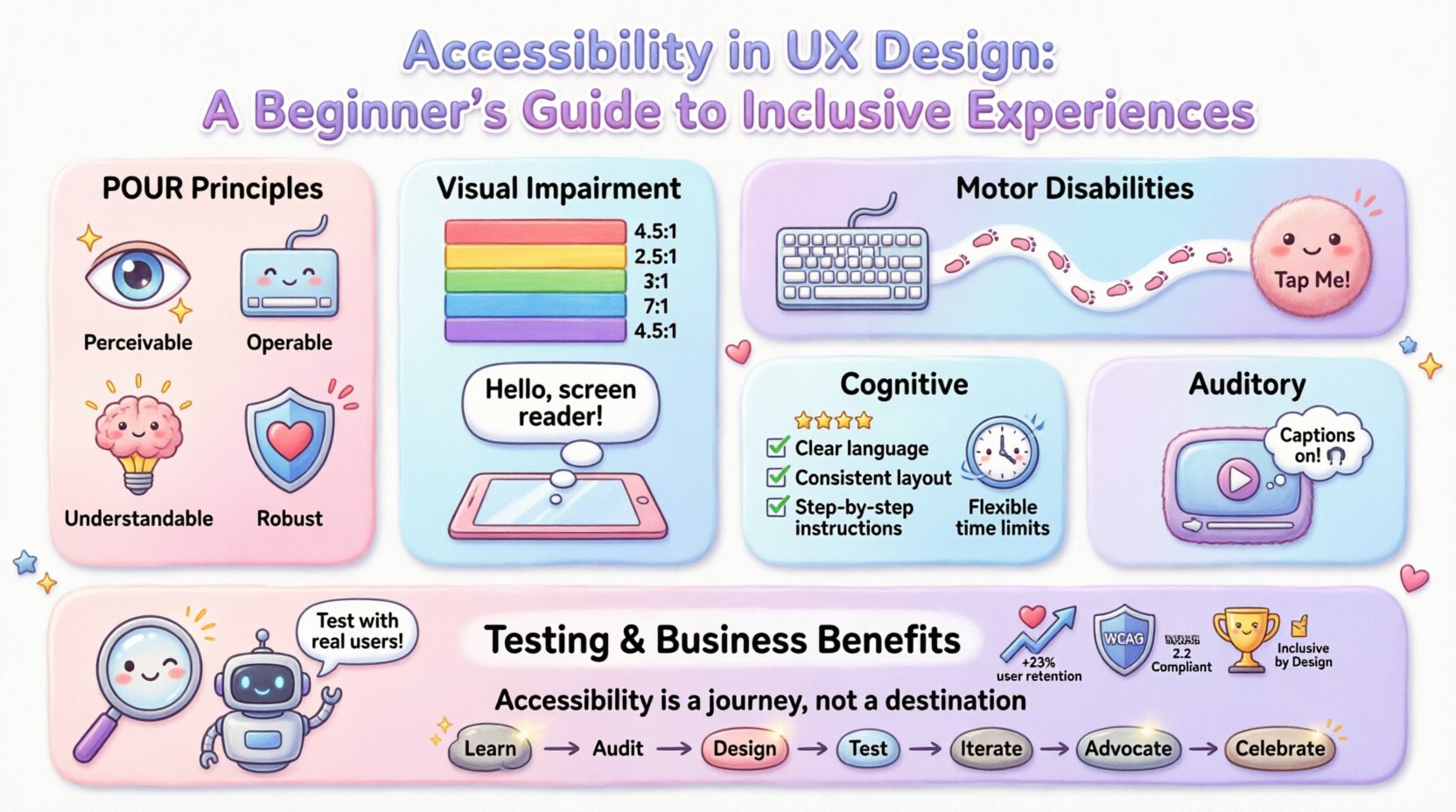
🧱 Core Principles of Accessible Design
Most accessibility guidelines, such as the Web Content Accessibility Guidelines (WCAG), are built upon four main principles. These are often remembered by the acronym POUR. Understanding these pillars is essential for any designer or developer.
1. Perceivable
Information and user interface components must be presentable to users in ways they can perceive. This means users must be able to understand the information being presented, regardless of the sensory modalities they rely on.
- Text Alternatives: Provide text alternatives for any non-text content so that it can be changed into other forms people need, such as large print, braille, speech, or symbols.
- Time-Based Media: Provide alternatives for time-based media, such as captions for videos.
- Adaptable: Create content that can be presented in different ways without losing information or structure.
- Distinguishable: Make it easier for users to see and hear content including separating foreground from background.
2. Operable
User interface components and navigation must be operable. This means users must be able to interact with the interface even if they cannot use a mouse.
- Keyboard Accessible: All functionality must be available from a keyboard.
- Enough Time: Provide users enough time to read and use content.
- Seizures and Physical Reactions: Do not design content that causes seizures or physical reactions.
- Navigable: Provide ways to help users navigate, find content, and determine where they are.
3. Understandable
Information and the operation of the user interface must be understandable. Users should be able to comprehend the information and understand how to use the interface.
- Readable: Make text content readable and understandable.
- Predictable: Make Web pages appear and operate in predictable ways.
- Input Assistance: Help users avoid and correct mistakes.
4. Robust
Content must be robust enough that it can be interpreted reliably by a wide variety of user agents, including assistive technologies.
- Compatible: Maximize compatibility with current and future user tools.
👁️ Designing for Visual Impairments
Visual impairments vary widely, from total blindness to low vision and color blindness. Designers must account for how users perceive color, contrast, and layout.
🎨 Color Contrast
Color contrast is critical for users with low vision or color blindness. Text and background elements must have sufficient contrast so that the text stands out. The standard ratio for normal text is 4.5:1, and for large text, it is 3:1.
| Text Size | Contrast Ratio Required | Recommendation |
|---|---|---|
| Normal Text (below 18pt) | 4.5:1 | High contrast preferred |
| Large Text (18pt+ or 14pt+ bold) | 3:1 | Medium contrast acceptable |
| UI Components | 3:1 | Focus indicators needed |
🔠 Screen Reader Compatibility
Many users rely on screen readers to navigate the web. These tools read out text and describe images. To support this:
- Alt Text: Always provide descriptive alternative text for images. Describe the function of the image, not just its appearance.
- Heading Structure: Use headings logically (H1, H2, H3) so screen readers can jump between sections.
- ARIA Labels: Use Accessible Rich Internet Applications (ARIA) attributes to describe complex widgets.
- Link Text: Ensure link text makes sense out of context. Avoid “click here”.
🖐️ Supporting Motor Disabilities
Users with motor impairments may have difficulty using a mouse, touch screen, or other pointing devices. They may rely on keyboards, switches, or voice control.
⌨️ Keyboard Navigation
Ensure that all interactive elements can be accessed using only a keyboard. This involves using the Tab key to move through the interface.
- Focus Order: The order in which elements receive focus should be logical and follow the visual layout.
- Focus Indicators: Provide a visible outline when an element is selected. Do not remove focus indicators.
- Shortcuts: Allow users to skip repetitive navigation blocks, such as a “Skip to Content” link.
👆 Touch Targets
For touch interfaces, buttons and links must be large enough to tap accurately. Small targets can be frustrating for users with tremors or limited dexterity.
- Ensure interactive elements have a minimum size of 44×44 pixels.
- Provide sufficient spacing between clickable elements to prevent accidental activation.
- Allow for hover states to be managed without requiring a mouse.
🧠 Addressing Cognitive Differences
Cognitive disabilities affect how users process information. This includes conditions like dyslexia, autism spectrum disorder, and attention deficit hyperactivity disorder. The goal is to make the interface simple, clear, and predictable.
📝 Readability and Language
Complex language can be a barrier. Use clear, simple language and avoid jargon. Break content into smaller chunks.
- Plain Language: Write for a lower reading level where possible.
- Consistency: Use consistent navigation and terminology throughout the site.
- Visual Aids: Use icons and images to support text, but ensure they do not add confusion.
⏱️ Time Limits
Sessions should not time out unexpectedly. If a task requires a specific time limit, provide a way to adjust or extend it.
- Warn users before a session times out.
- Offer options to disable automatic timeouts.
- Ensure forms can be saved and resumed later.
🔊 Managing Auditory Needs
Users who are deaf or hard of hearing need access to audio content. Relying solely on sound excludes these users.
🎬 Video and Audio
- Captions: Provide synchronized captions for all pre-recorded video content.
- Transcripts: Provide text transcripts for audio-only content like podcasts.
- Sign Language: Consider providing sign language interpretation for important videos.
🔍 Testing and Validation Strategies
Designing for accessibility is not a one-time task. It requires ongoing testing and validation to ensure compliance and usability.
Manual Testing
Automated tools cannot catch everything. Human testing is crucial.
- Keyboard Testing: Navigate the entire site using only the keyboard.
- Screen Reader Testing: Use a screen reader to experience the site as a blind user would.
- Zoom Testing: Zoom the browser to 200% to ensure layout holds up.
Automated Testing
Use automated tools to identify common issues quickly. These tools can check for missing alt text, color contrast ratios, and broken links.
- Run checks during the design phase.
- Integrate checks into the development pipeline.
- Review reports regularly to track progress.
💼 The Business Case for Inclusion
Accessibility is often viewed as a cost center, but it is actually an investment. Inclusive design leads to better products for everyone.
📈 Market Reach
By making your product accessible, you expand your market. You gain access to older adults and people with temporary disabilities, such as a broken arm.
🏛️ Legal Compliance
Many countries have laws requiring digital accessibility. Non-compliance can lead to lawsuits and fines. Staying ahead of regulations protects your organization.
🏆 Brand Reputation
Companies that prioritize accessibility are viewed as more ethical and customer-focused. This builds trust and loyalty among users.
🚫 Common Pitfalls to Avoid
Avoiding mistakes is just as important as implementing best practices. Watch out for these common errors.
- Using Color Alone: Do not convey information using color alone. Use text or icons as well.
- Auto-playing Media: Avoid media that plays automatically without user control.
- Overusing Animations: Provide controls to pause or stop animations that could cause seizures or distraction.
- Ignoring Error Messages: Ensure error messages are clear and provide solutions for correction.
- Hidden Content: Do not hide content from screen readers using CSS display:none if it is still visible.
🚀 Looking Ahead
The field of accessibility is evolving. New technologies and standards are emerging constantly. Staying informed is key to maintaining an inclusive product.
- Voice Control: As voice interfaces grow, ensuring commands are clear and responsive is vital.
- AI Integration: Artificial intelligence can help automate alt text generation and content analysis.
- VR and AR: Virtual and augmented reality present new accessibility challenges regarding spatial audio and visual cues.
📝 Final Thoughts
Accessibility in UX design is about empathy. It is about understanding that users interact with technology in different ways and ensuring no one is left behind. By following the principles outlined in this guide, you can create digital experiences that are robust, inclusive, and effective for everyone. Start small, test often, and commit to continuous improvement.
Remember, accessibility is not a destination; it is a journey. Every step you take toward inclusion makes the digital world a little more open for everyone.

